Brand refresh
Standards Australia
The Brief
Expressing their value
Standards Australia has a long history as the leading provider of Australian standards and enjoys a strong international reputation. However, it faced growing challenges within Australia, with low awareness of their purpose amongst the public, and mixed perceptions of their value within industry and business. A shift in their business strategy meant redefining their underlying brand strategy and translation to a refreshed visual brand.
The Challenge
Fixing the fragmentation
Standards Australia’s visual identity had been hampered by a history of fragmented brand development. A limited style guide and disjointed brand palette, combined with an overly ornate master logo and a collection of unrelated sub-brands, had resulted in brand inconsistencies, dilution and confusion. The challenge was to retain the heritage and trusted values of the Standards Australia brand while elevating its visual identity and introducing greater modernity, clarity and dynamism.
The Solution
Transactional to trusted
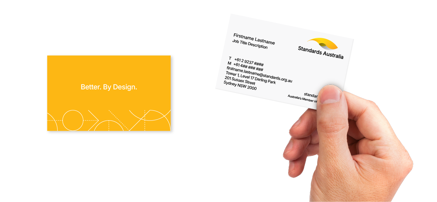
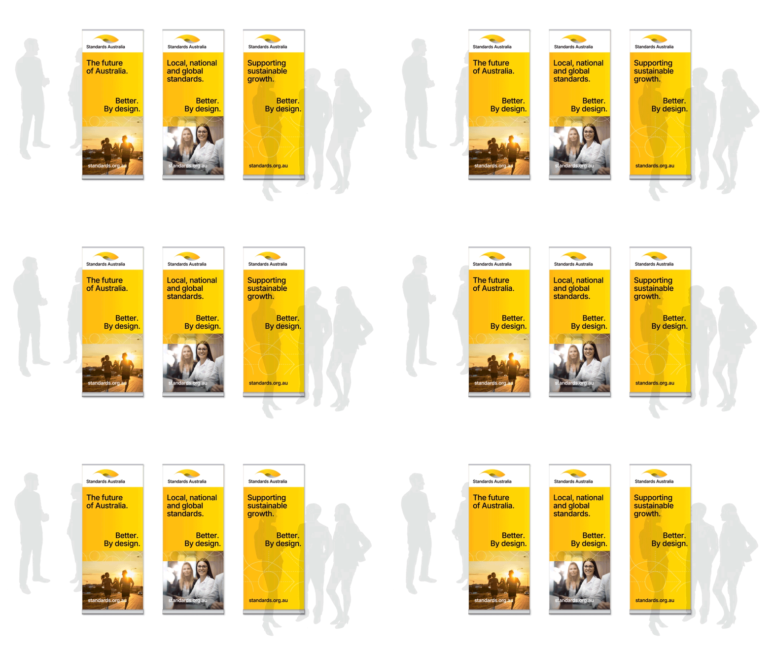
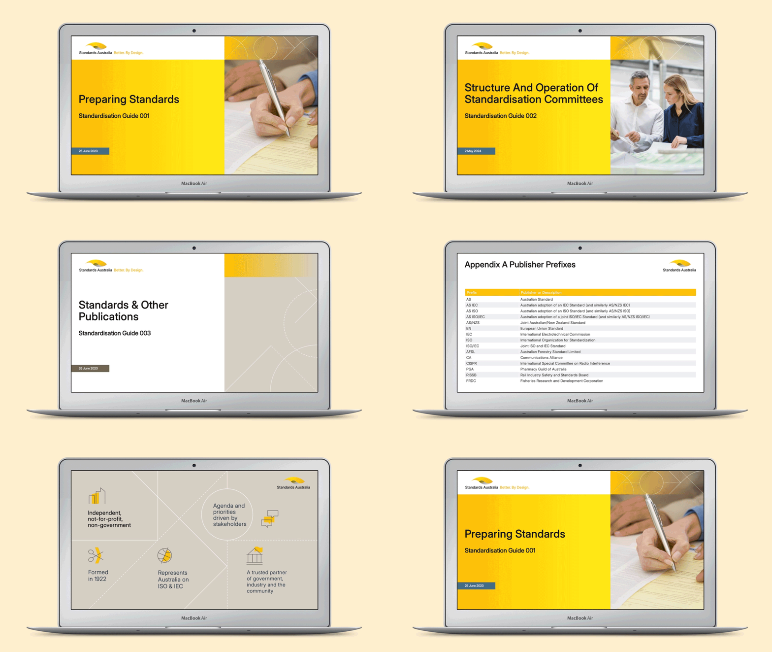
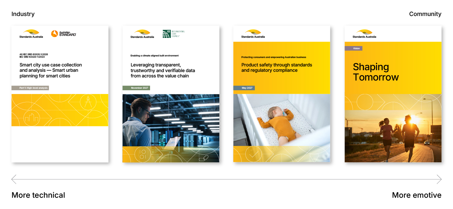
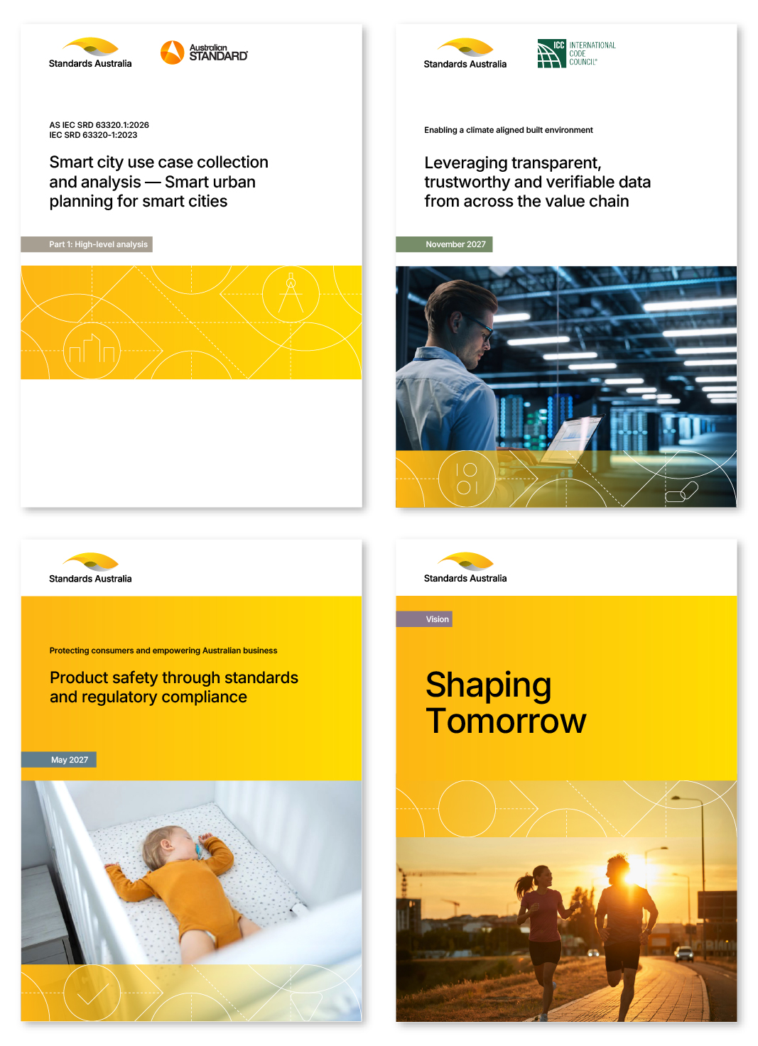
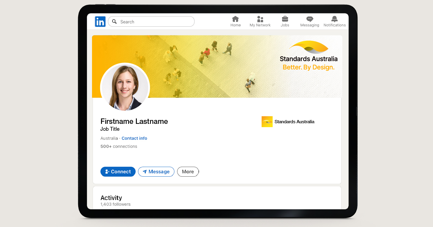
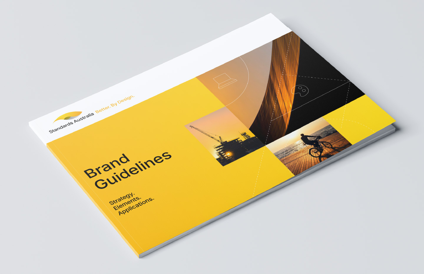
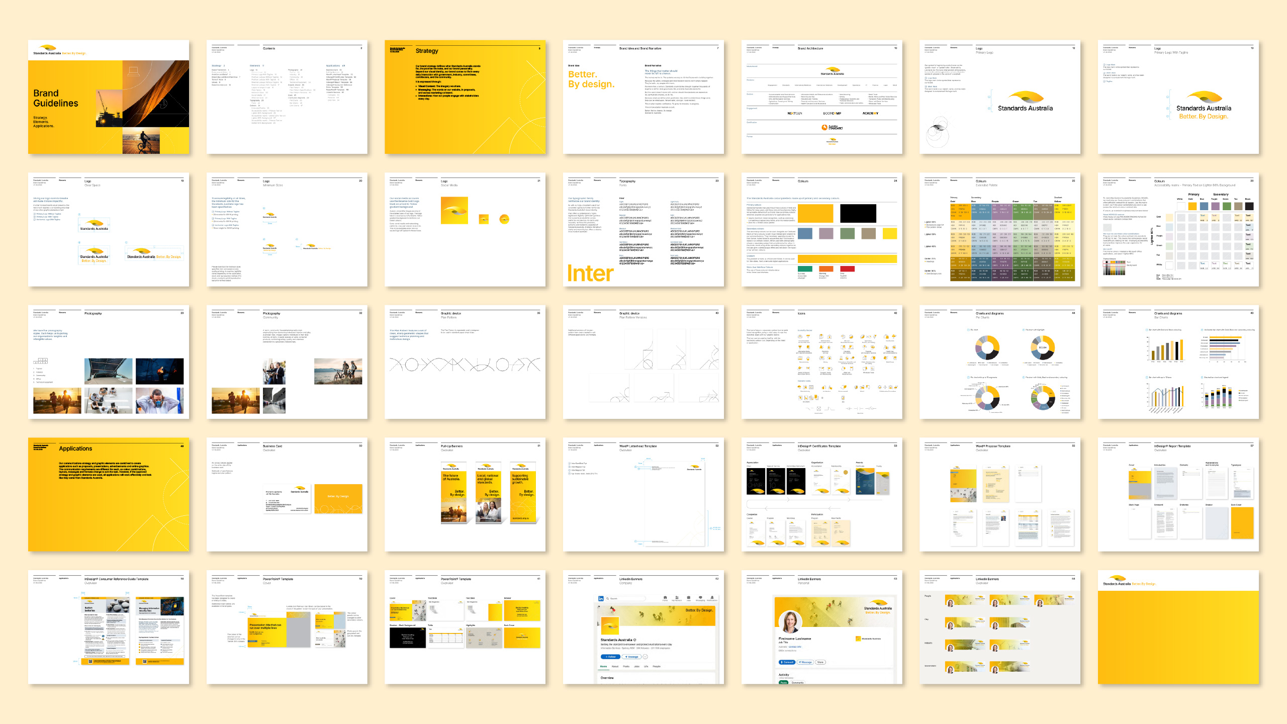
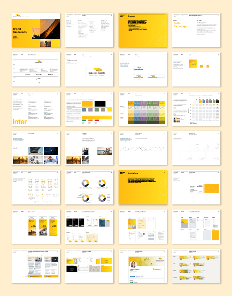
‘Better. By design’ is the new strategy developed by Standards Australia. We connected this strategy to a refreshed, purposeful brand palette which included: a streamlined set of logos and brand architecture; new fonts; photography; a strong and flexible colour palette; the introduction of a dynamic new design device, the ‘plan pattern’. All these elements work together to build a more progressive and value-led brand for Standards Australia.