Bletchley Consulting
The Brief
Experience meets classic design
When the time came for our client to go out on her own as a consultant, she asked us for a brand identity with beauty, one that had an art deco feel with a contemporary edge.The Challenge
Old world elegance in a contemporary marketplace
The distinctive, art deco feel of the identity needed to be tailored for a conservative audience. The brand design also had be executed in a way that was easy and cost-efficient to produce now and into the future. Champagne styling on a tea bag budget.The Solution
Float like a butterfly, sting like a bee
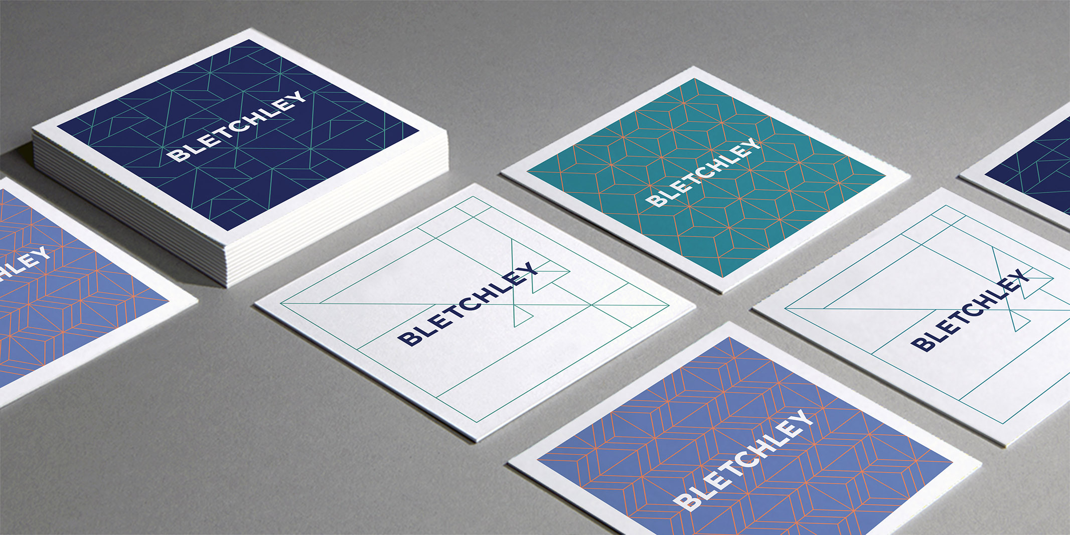
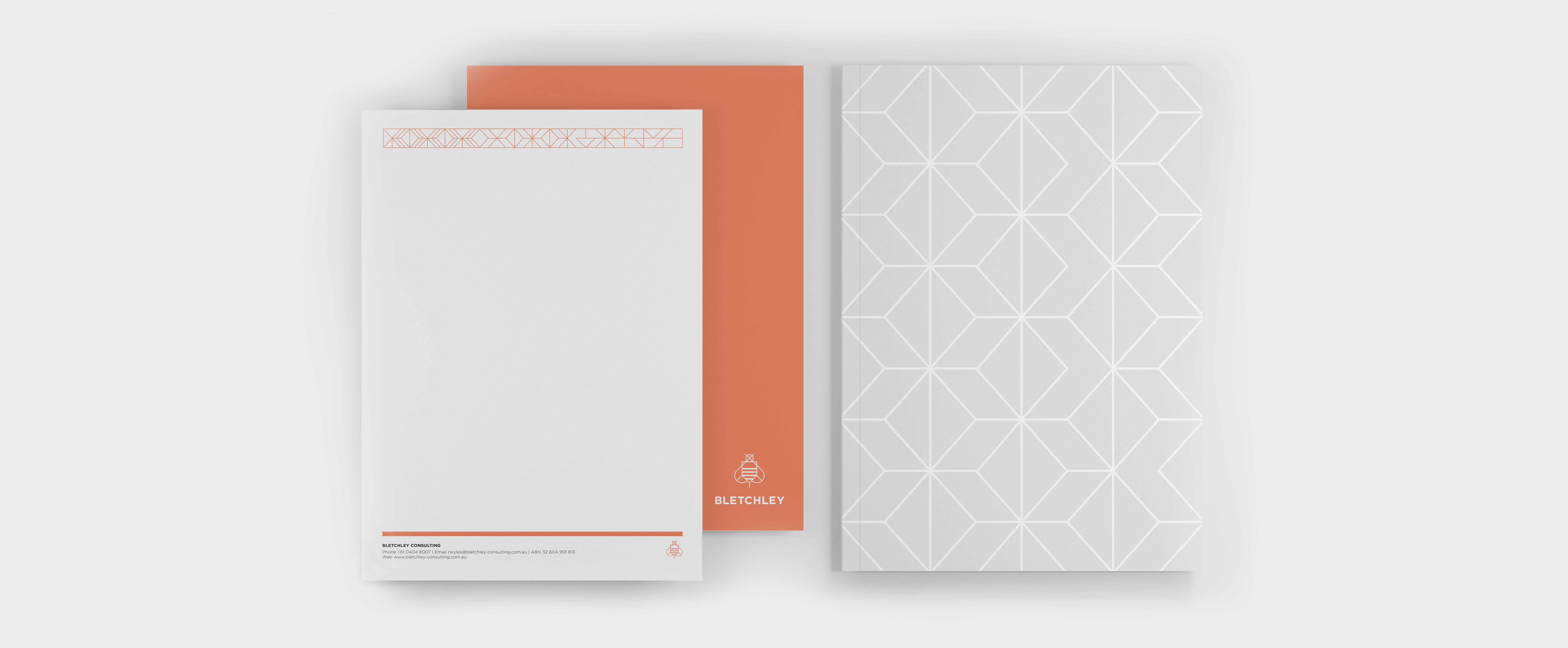
The resulting brand palette manages to be both vintage and modern and very flexible, with a set of economically printed, luxe square finish business cards with different, yet complementary vintage patterns. As well as being a play on the letter ‘B’, the bee in the logo is a timeless element, so beloved in art deco design, particularly jewellery. It also embodies our client’s sense of fun and industriousness.


