Brand refresh
Workstar
The Brief
Refreshing learning
Workstar is a leading Australian experiential e-learning company which counts top tier corporate, retail and government organisations amongst their clients. Following a successful internal strategy program, Wills Brand Design was commissioned to refresh and extend their brand palette and communications style.
The Challenge
Communicating intangible value
Like many industries, the e-learning world is purely digital. Visual cues of blackboards, pencils and books are no longer relevant. Their competitors use abstract metaphors, meaningless stock imagery, and graphic decoration. Our task? To genuinely communicate the value of Workstar's award-winning approach – bespoke, personalised learning solutions that use real-world scenarios and unmatched creativity.
The Solution
A brand palette that works
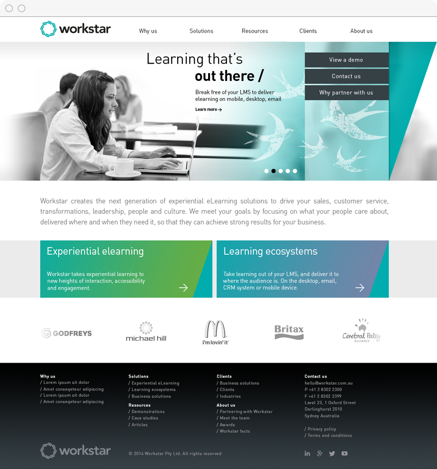
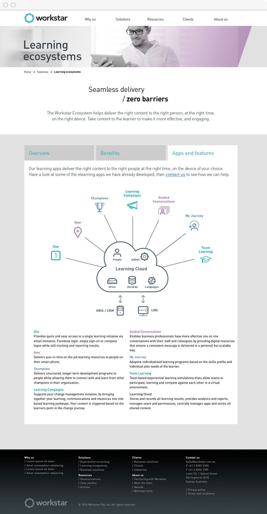
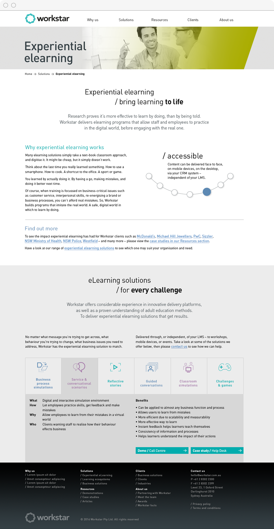
Every aspect of the brand palette got a makeover. Lively, sophisticated colours combined with transparent diagonal panels. A regular/bold typography style was set in a crisp, clinical typeface. Black and white imagery showcased professionals in real-world learning environments, overlaid with creative illustrations. This distinctive new style was applied to a newly built corporate website, their social media channels, and the email communications.


