Brand Design
Dunnaran + Partners
The Brief
Heralding in a new chapter
Dunnaran + Partners may be a new law firm with a new name in Ulaanbaatar, Mongolia, but it is not a start-up – it was previously the Mongolian office of a multinational law firm. Dunnaran + Partners required a completely new brand design identity which would herald in this transformation and indicate to local and international clients their established history as trusted legal advisors in the region.
The Challenge
Remote yet close
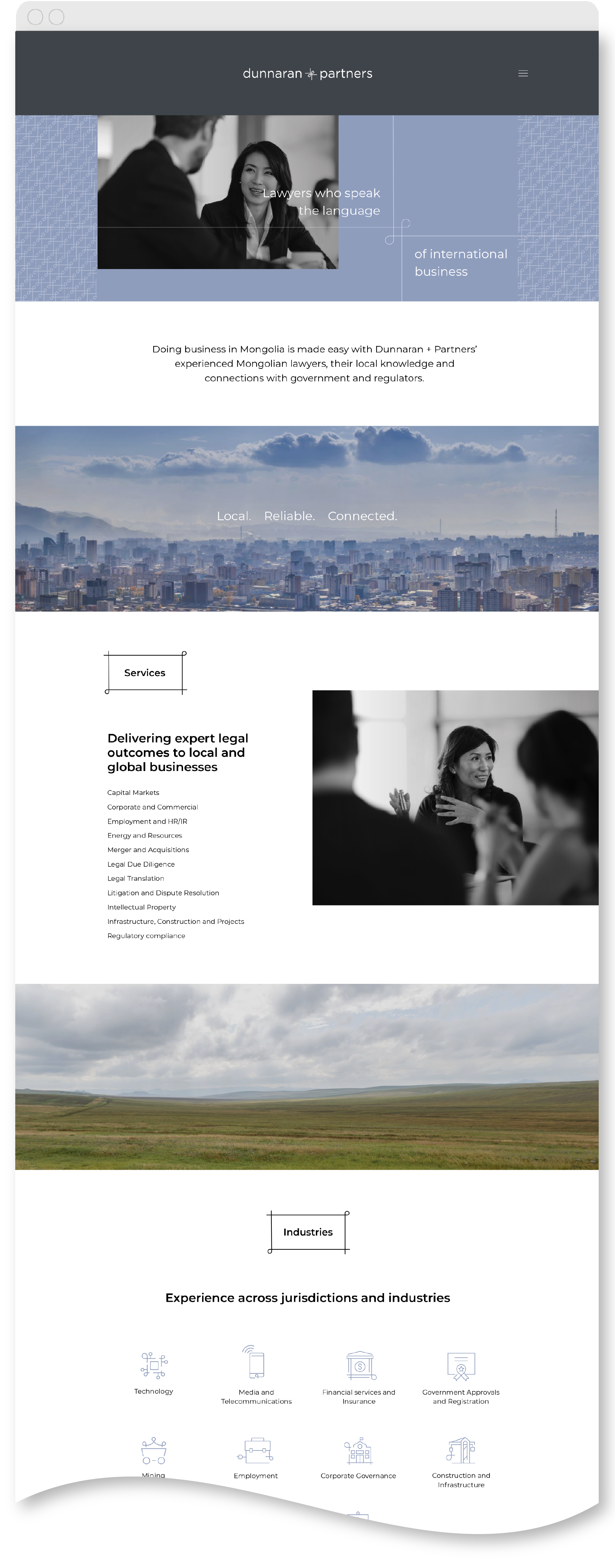
Creating a brand design identity for a Mongolian law firm was a first for us, but the steps we took to create their new branding were not. Despite our remote locations and tight deadlines, we worked closely with our client to discover their unique brand personality and distil this into a meaningful brand design palette. Unable to be on the ground at photography shoots, we created detailed brand design briefs for photographers and also art directed their website and signage remotely.
The Solution
A brand with strong ties
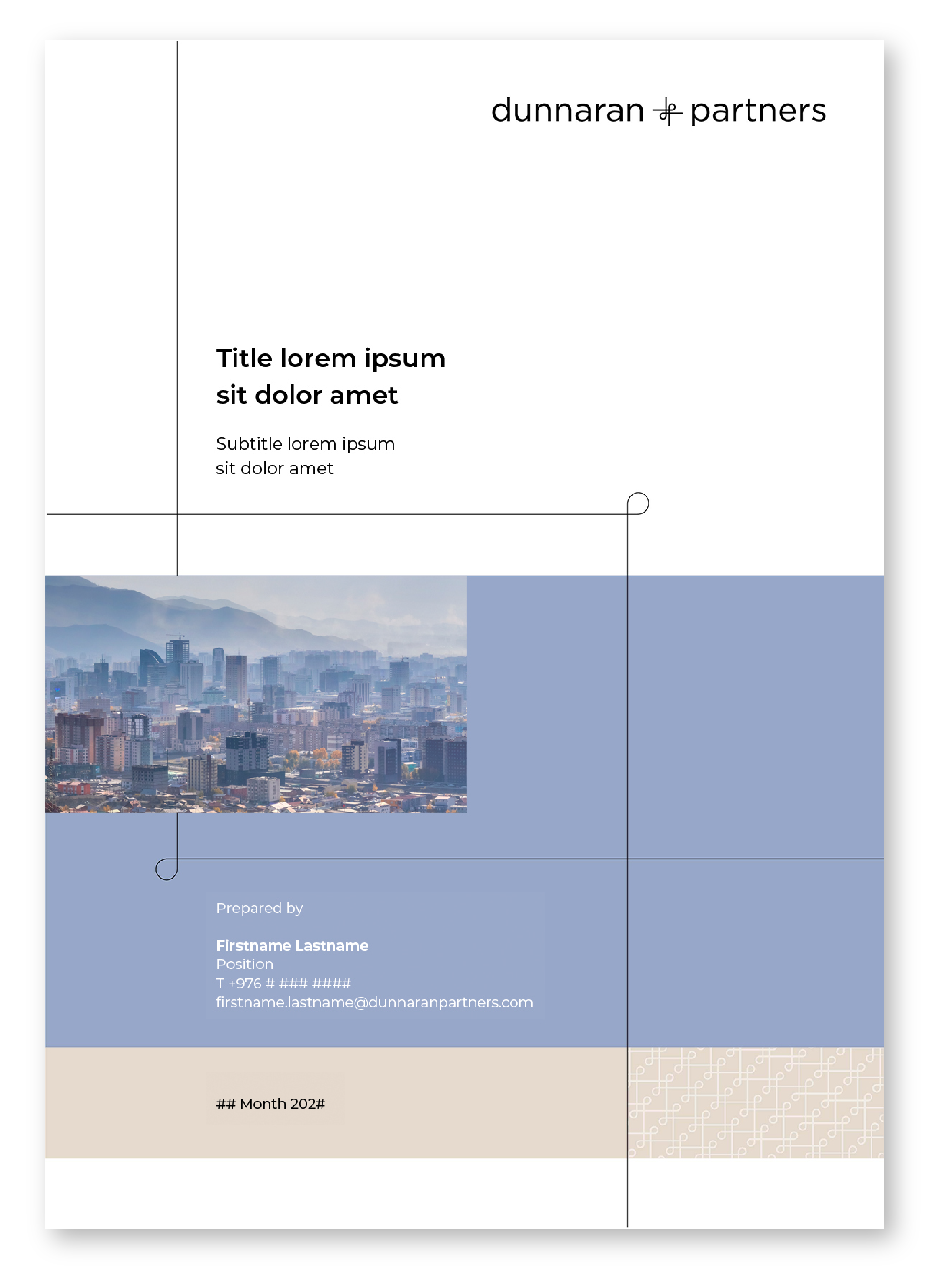
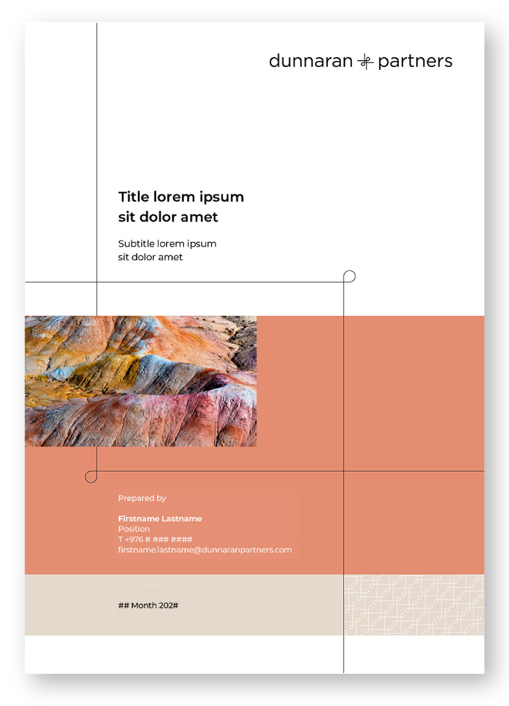
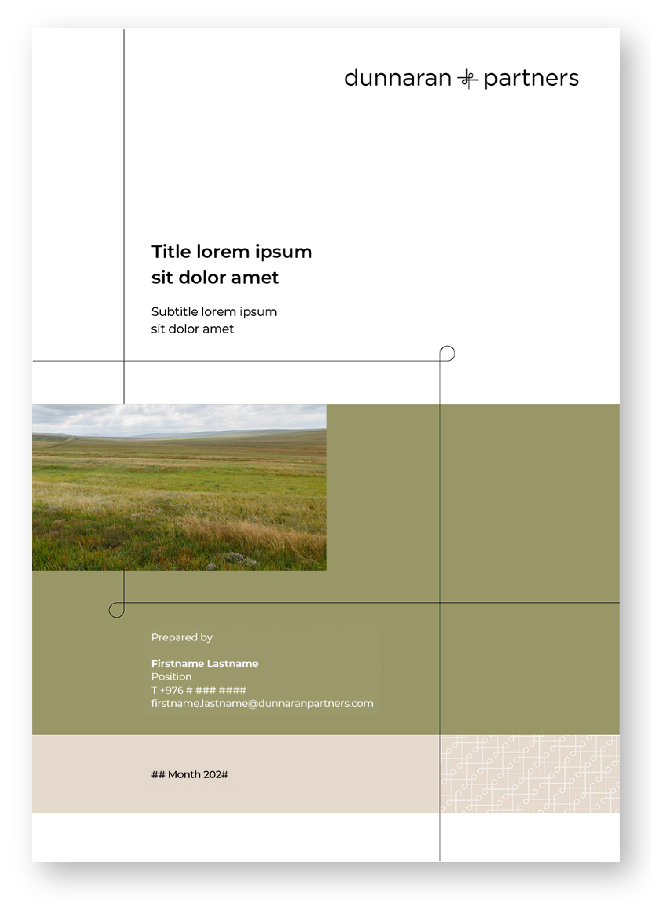
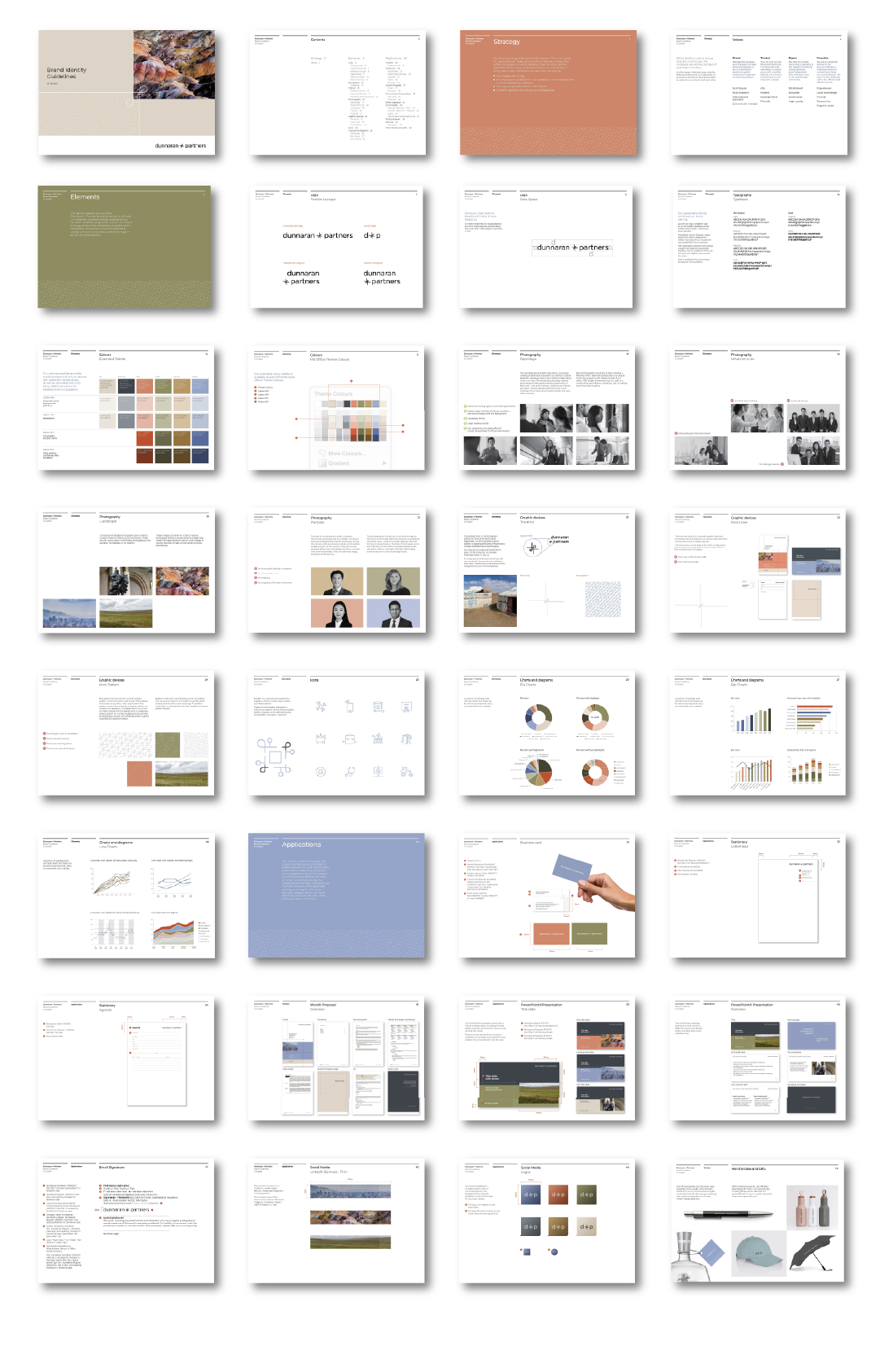
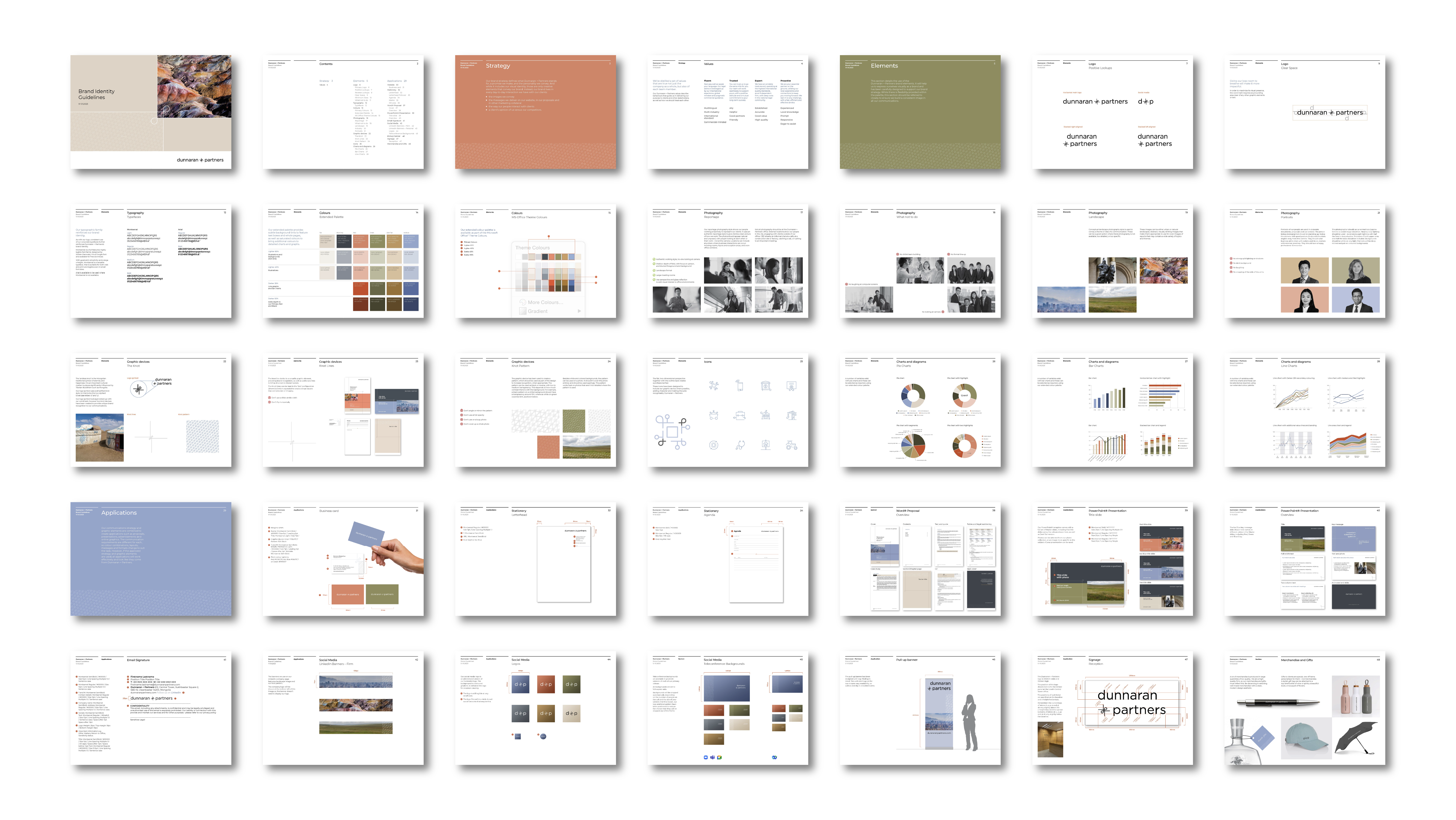
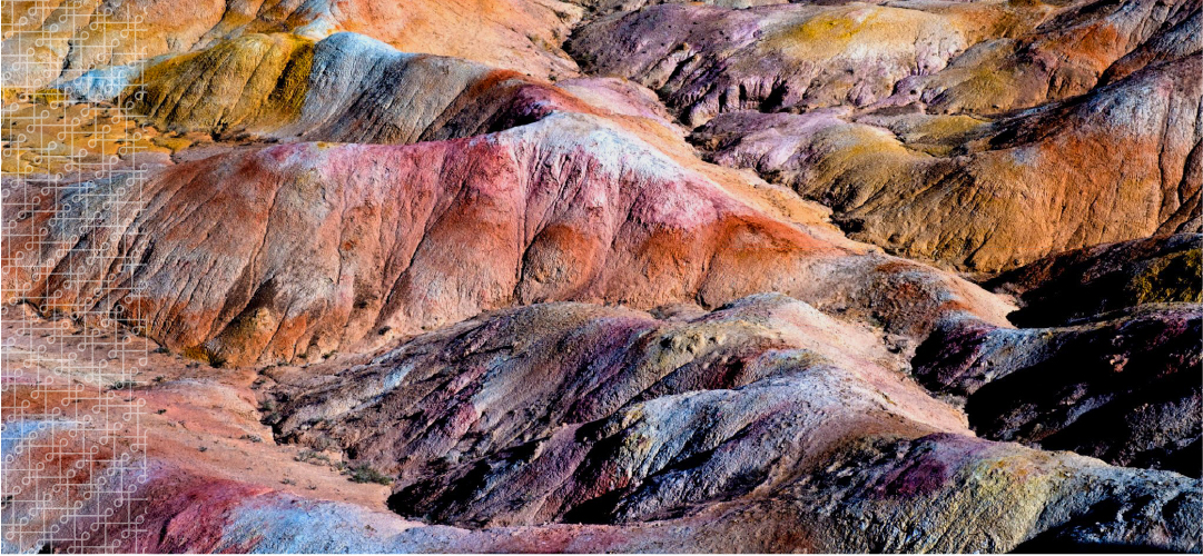
Inspired by the Mongolian ‘endless knot’, we built the brand design around our own knot device, the ampersand in the new logo. The device is used as a feature throughout the brand palette to bring together messages and graphics. The knot helps tie together Dunnaran + Partners connected offer as being a multi-lingual firm with strong local knowledge and expertise and international experience. The muted colour palette and natural, authentic photography are balanced with clean, modern professionalism.

