e-Learning Brand Design
MasterE Learning Solutions
The Brief
Telling real stories
We love designing branding for start-ups and working with small business owners who have a passion for what they do, and great ideas for a new venture. Our client had considerable experience working in the government e-learning sector and was taking the plunge to launch her own enterprise. With a limited budget and unlimited ambition, she needed an e-learning brand design that captured her passion and point of difference – learning that uses storytelling as the basis to provide critical safety training, mastering systems use, and doing social good.
The Challenge
Breaking the mould
Start-up branding usually means branding on a budget, but with clever design it is achievable to create a brand that would differentiate them in a market crowded with some dominant players. e-Learning brand design tends to be fairly narrow in style, typically a friendly, colourful look and feel, with a software company aesthetic. From naming through to website, it was important that we designed a brand that reflected MasterE's unique focus on critical learning and social enterprise. And given the focus of e-learning for government, NGOs and Safety clients, it was important that we conveyed MasterE's serious, cost-effective, and pragmatic approach to learning delivery.
The Solution
The unvarnished truth
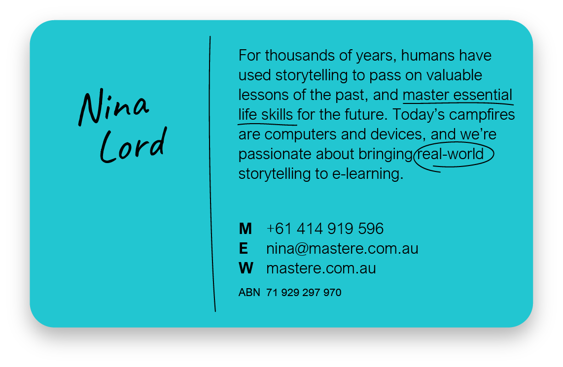
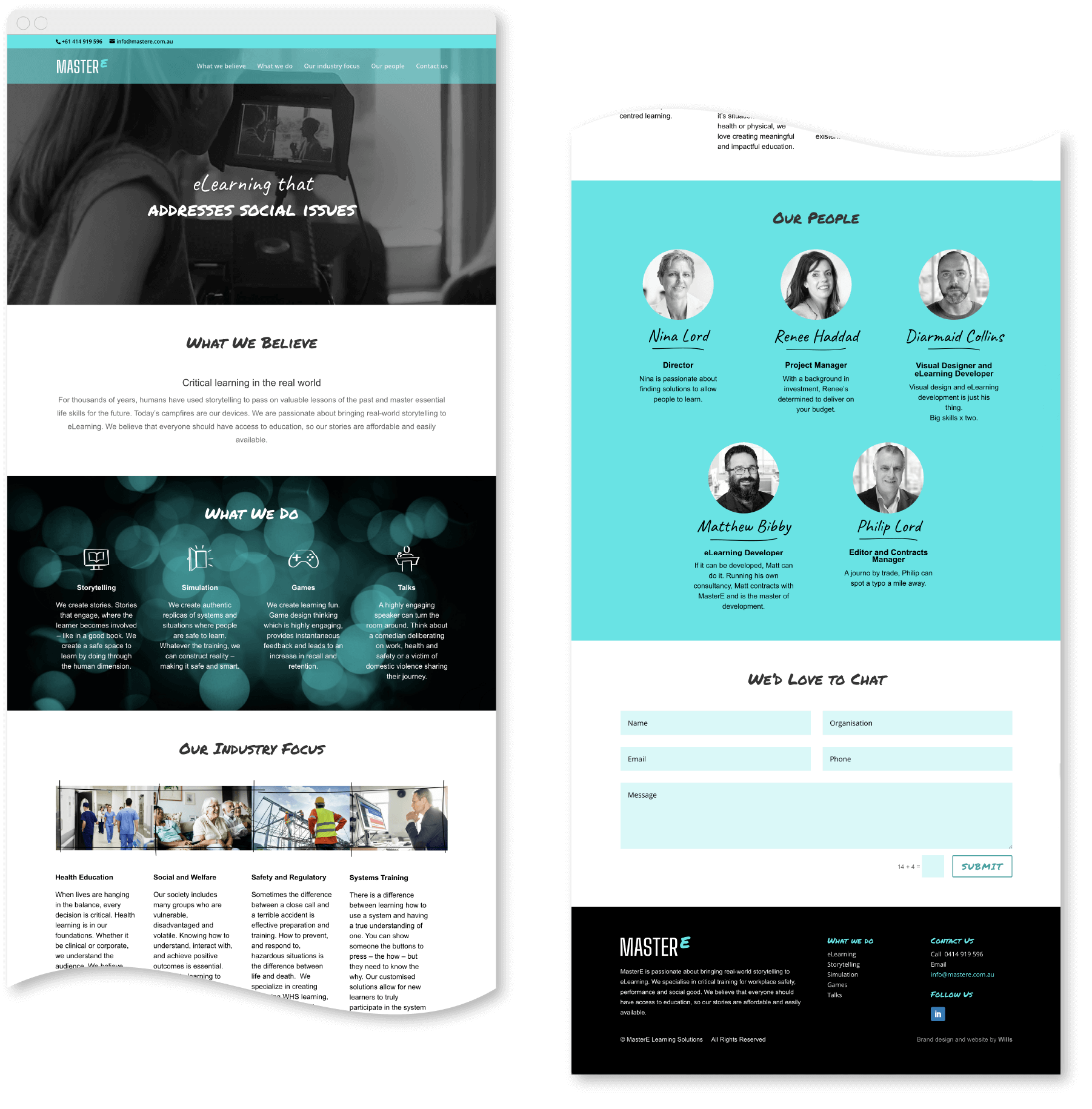
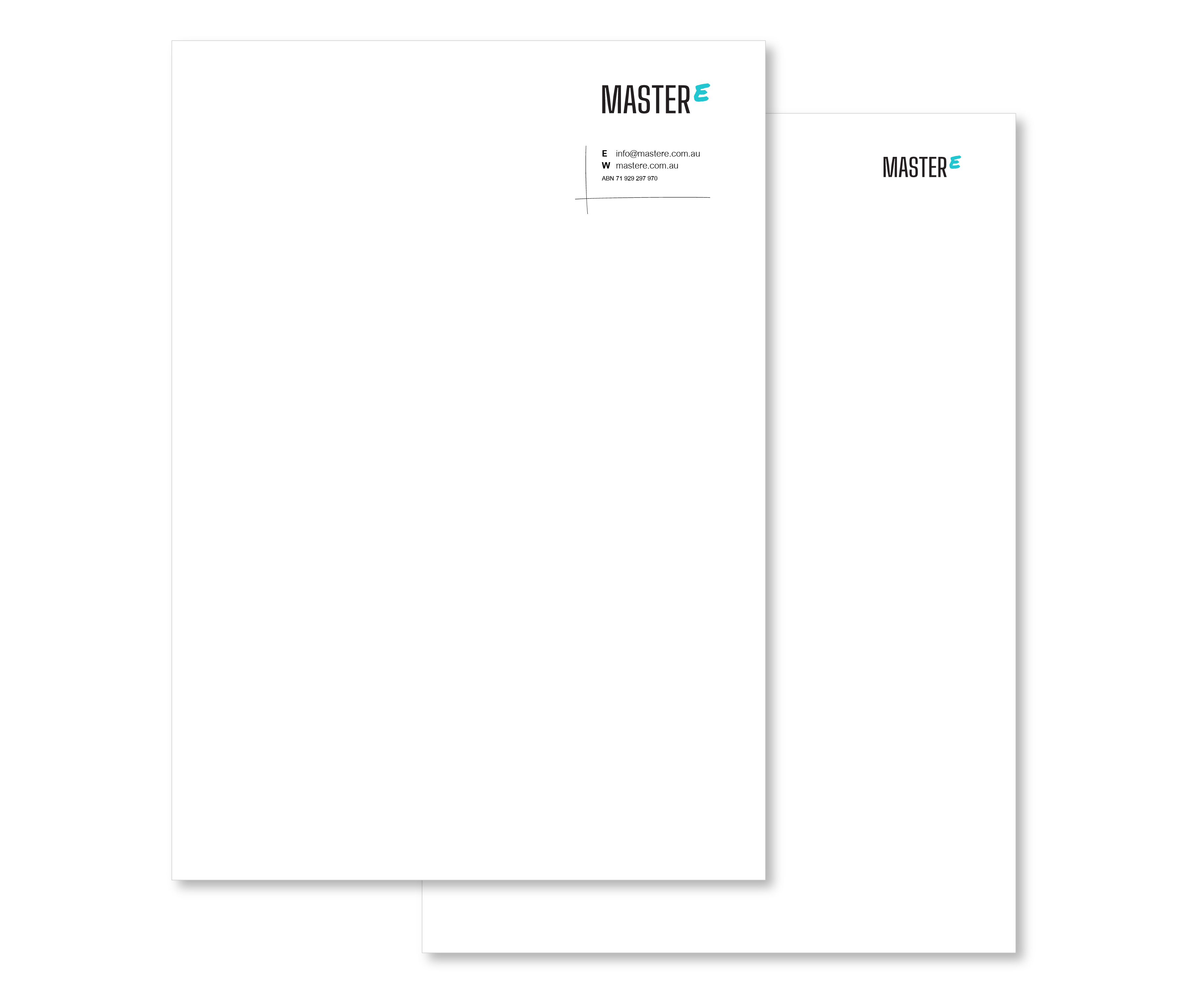
The brand name ‘MasterE' resulted from a workshop with our client and captured their promise to not simply provide just-in-time or sales training, but ‘mastery' of critical skills and systems. The concept behind the brand identity brings together two thoughts: engaging storytelling and doing social good. The visual design conveys a raw honesty, with hand-written notes and mark-up, a simple two-colour palette, and documentary style, black and white photography. A start-up set of essential applications was produced including a business card, e-letter template, email signature, LinkedIn banners and a website.

