Brand Creation
Juvenile Arthritis Foundation Australia (JAFA)
The Brief
A hidden crisis
There is currently very low awareness amongst health professionals, governments, and the wider community about the prevalence of juvenile arthritis (JA) in Australia. JAFA aims to urgently raise awareness about JA, lobby governments to fund scientific research, and elevate the treatment and care of children suffering with JA. JAFA needed an impactful brand that would help drive and support this mission.
The Challenge
Revealing the reality
JA is a serious illness but also a childhood one, so the brand needed a light touch while communicating a serious message. Veering too much into the territory of ‘playful’ could confuse their brand with other established charities and undermine their urgent funding need. As a volunteer-based, emerging charity, it would also need to be cost-effective and easy for JAFA’s people to produce communication collateral.
The Solution
Striking Out
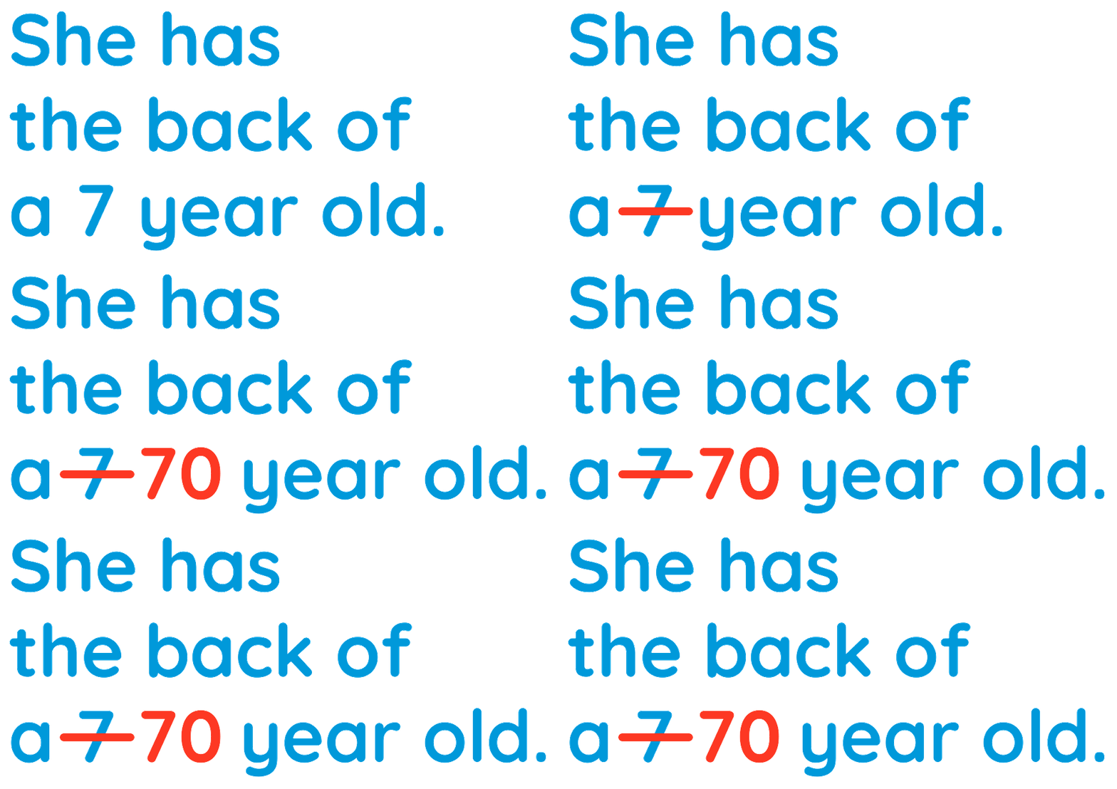
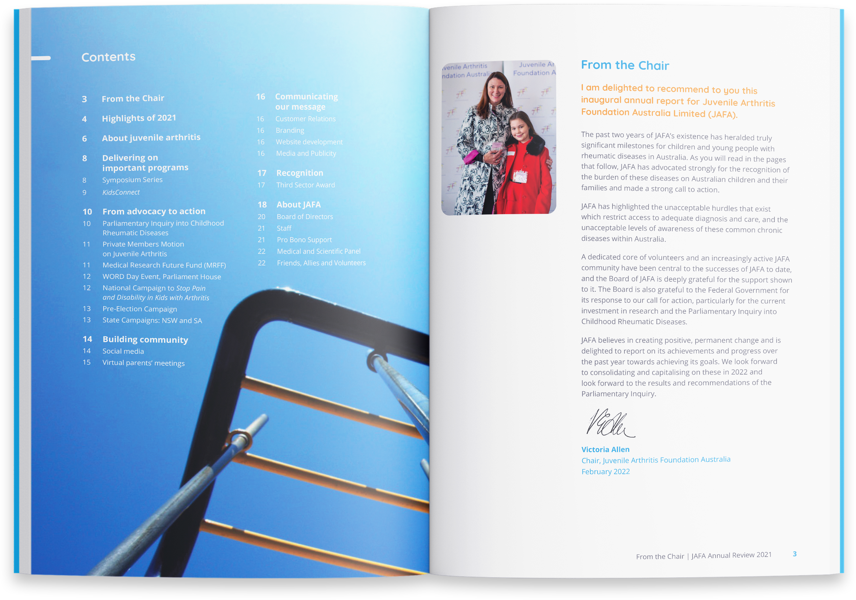
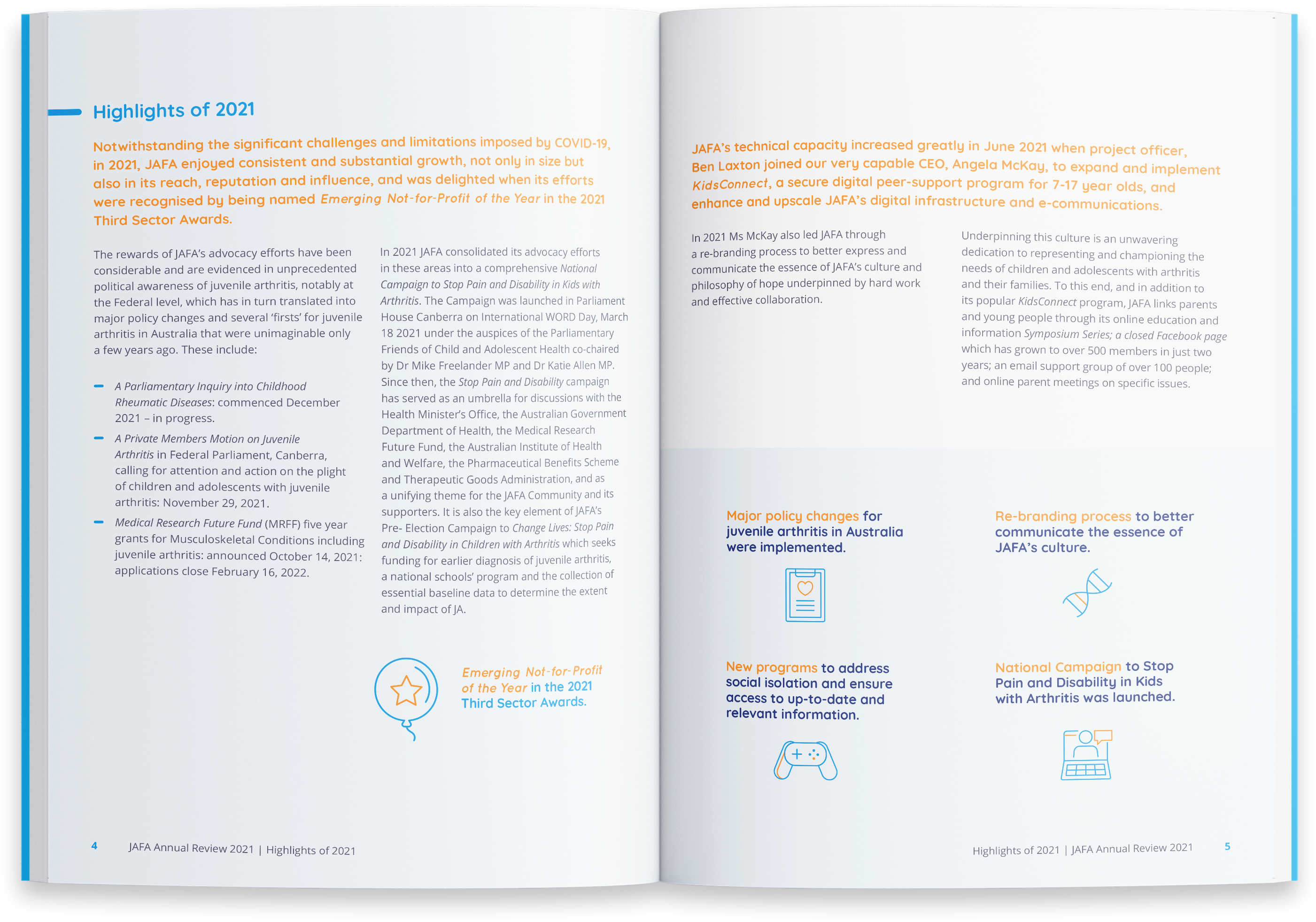
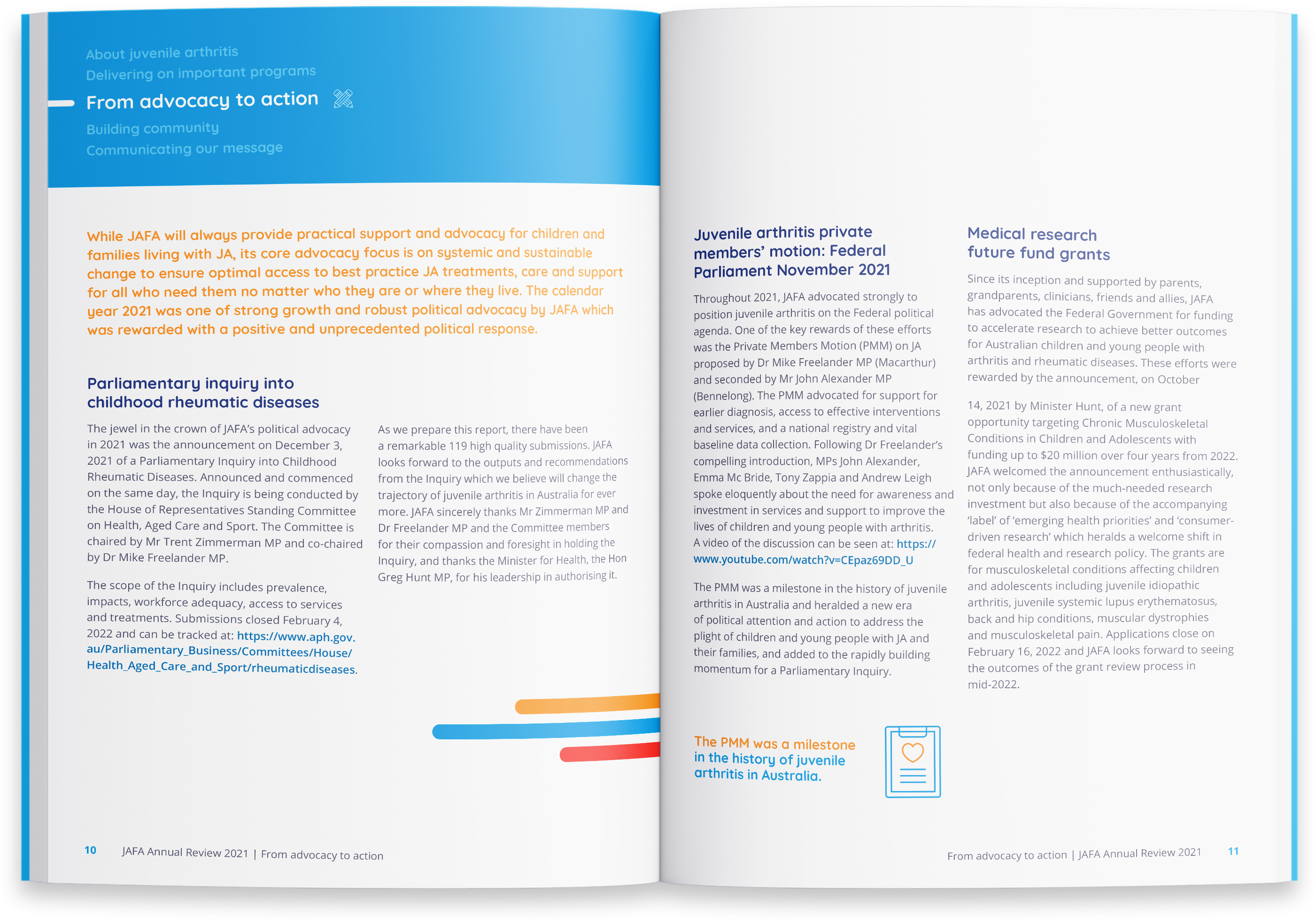
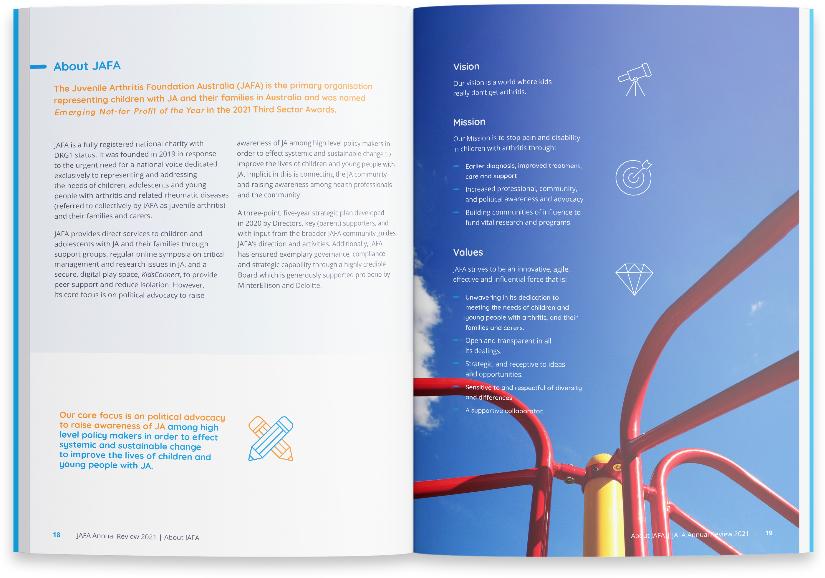
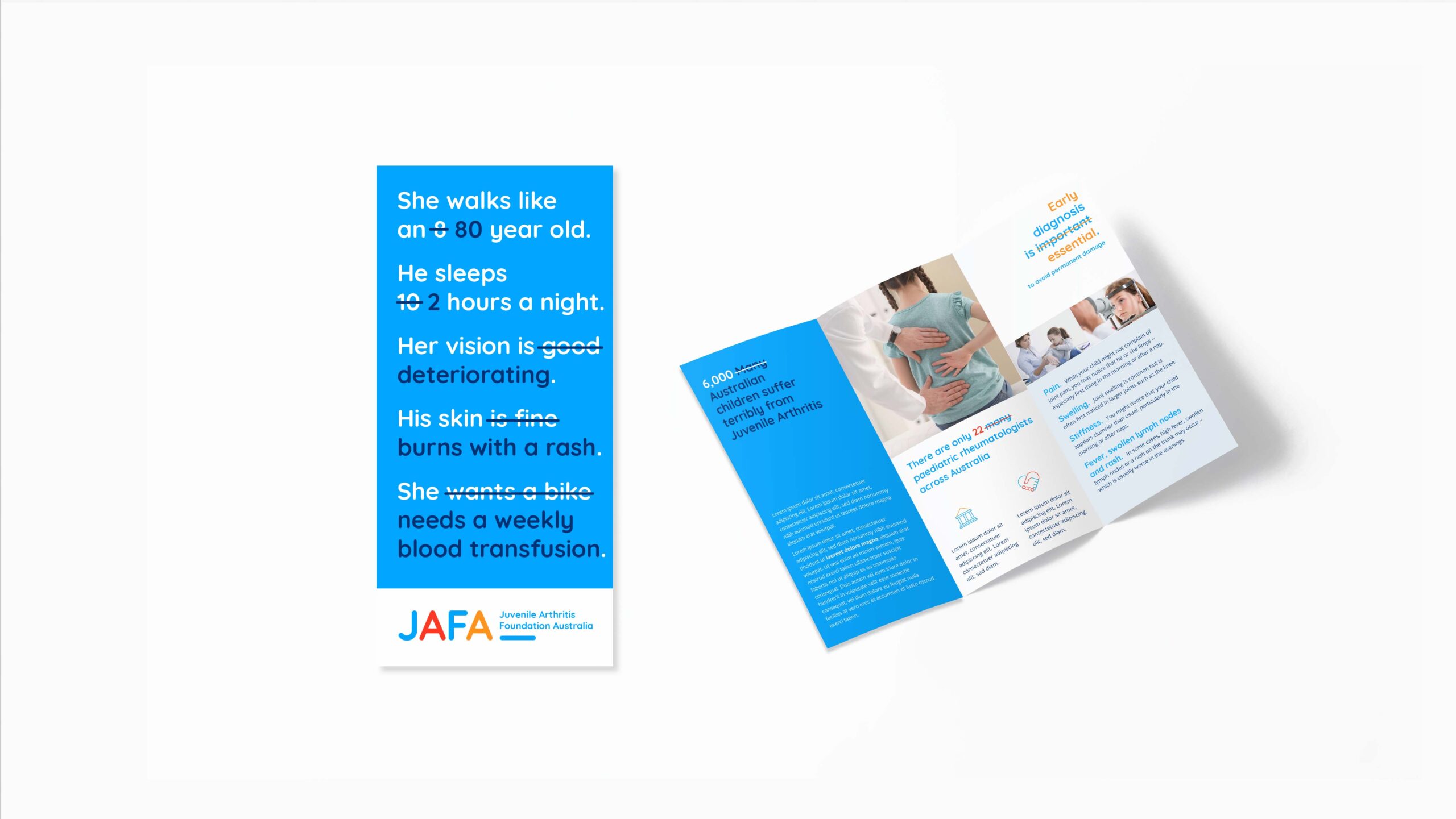
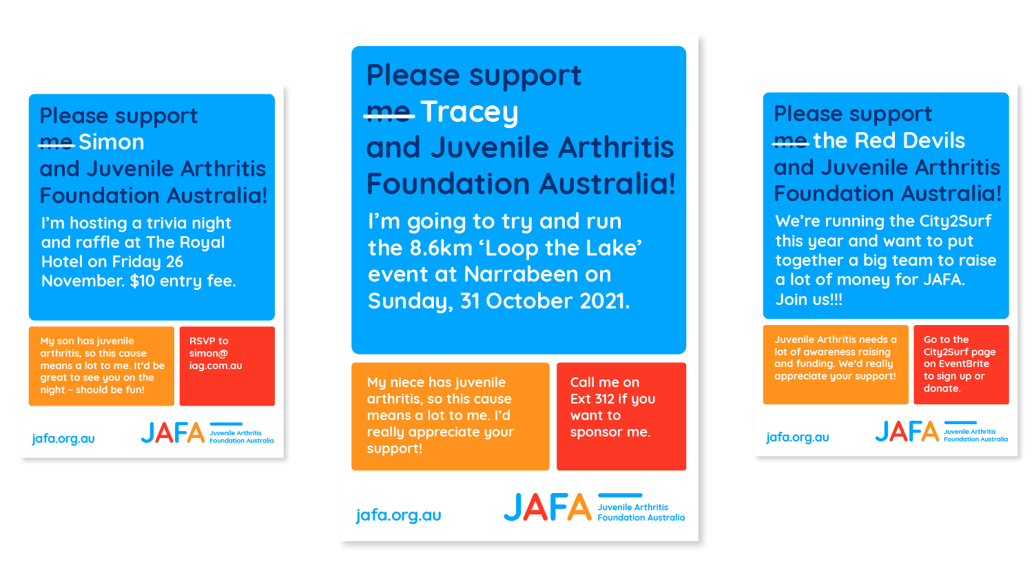
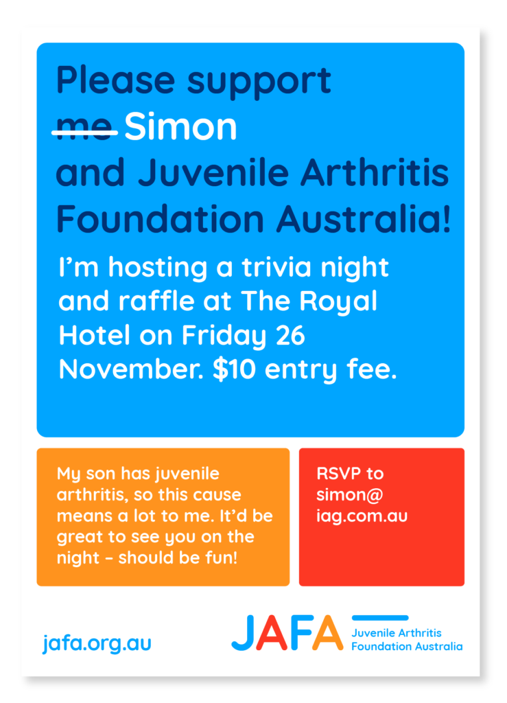
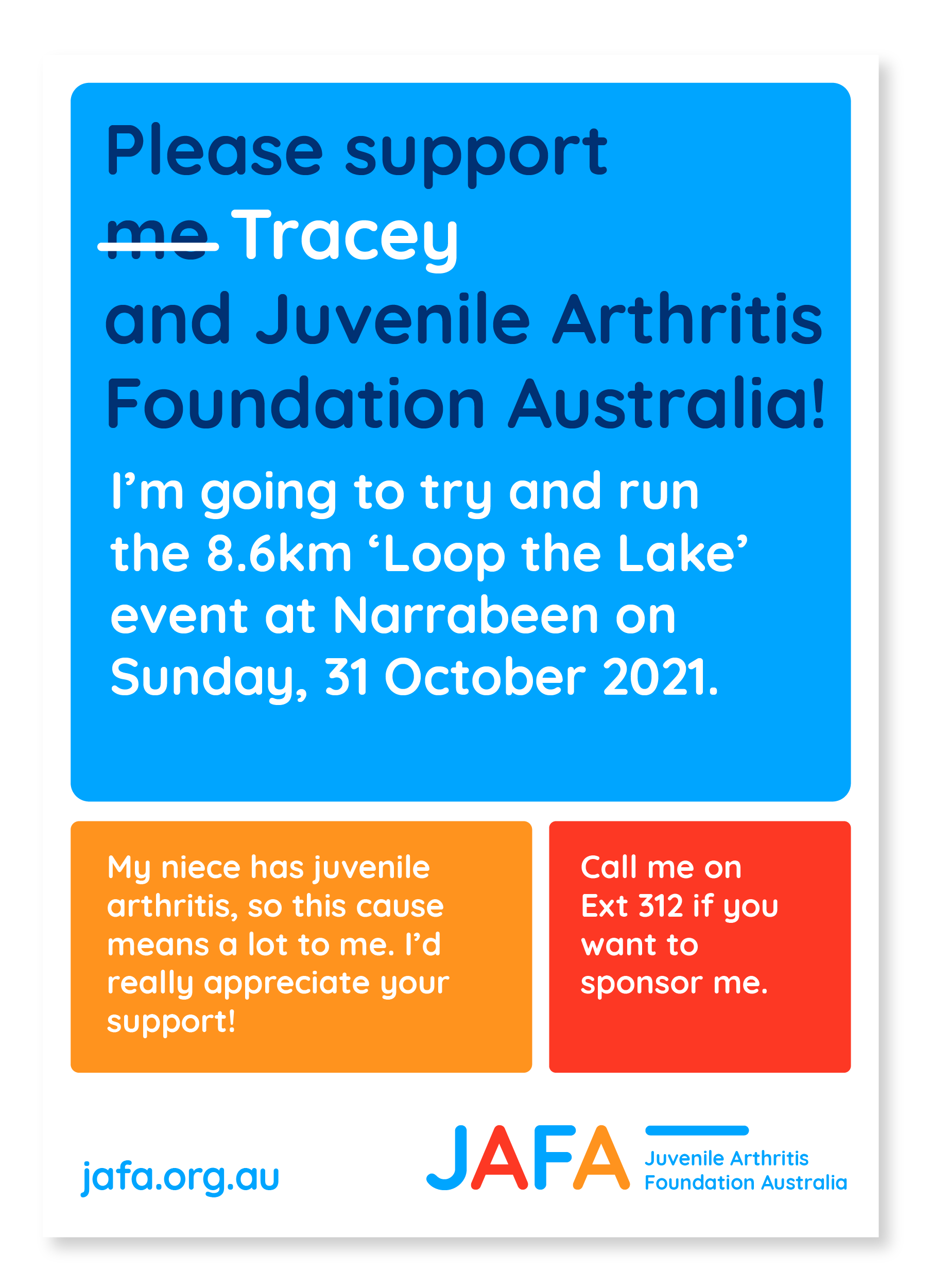
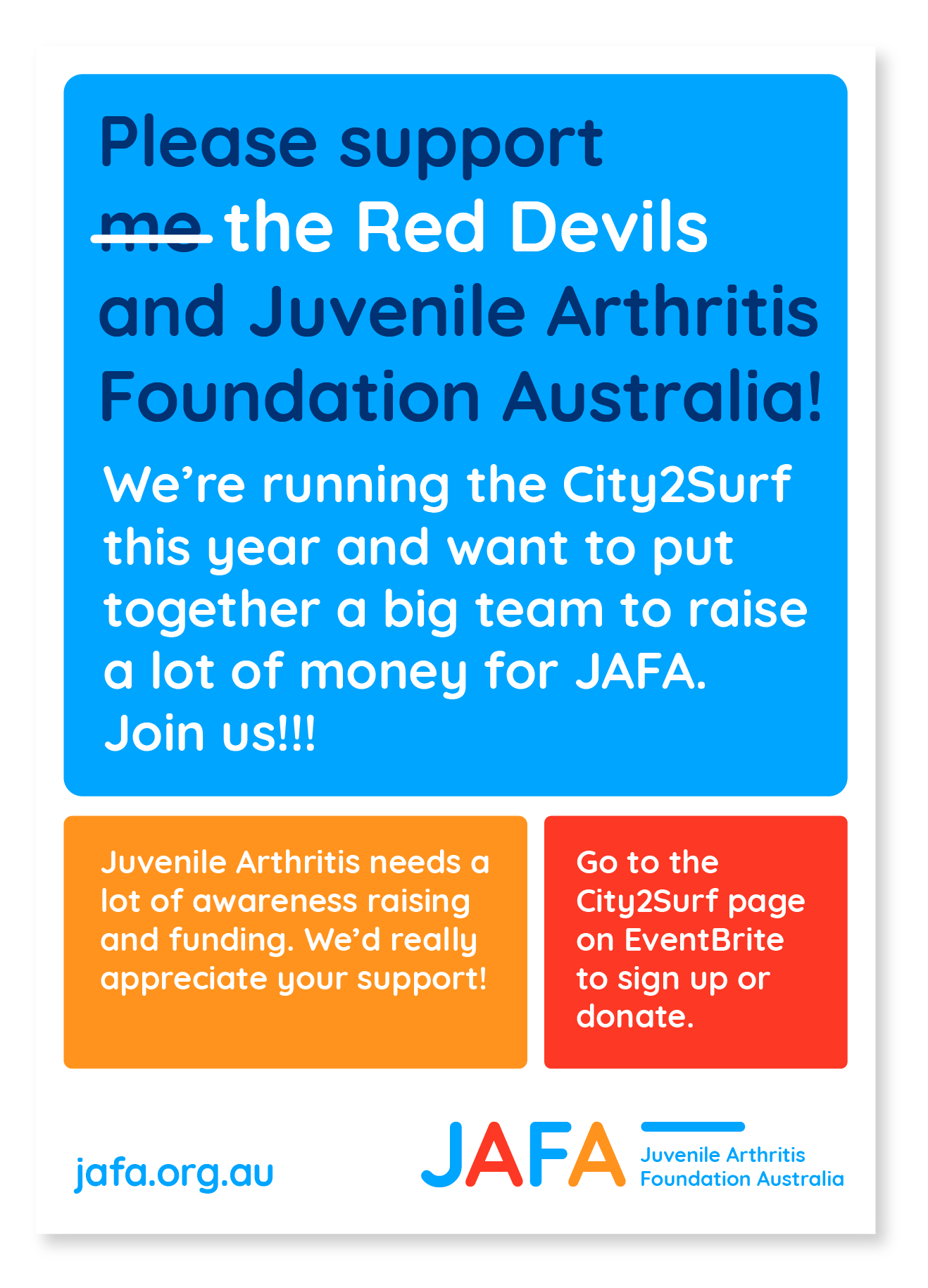
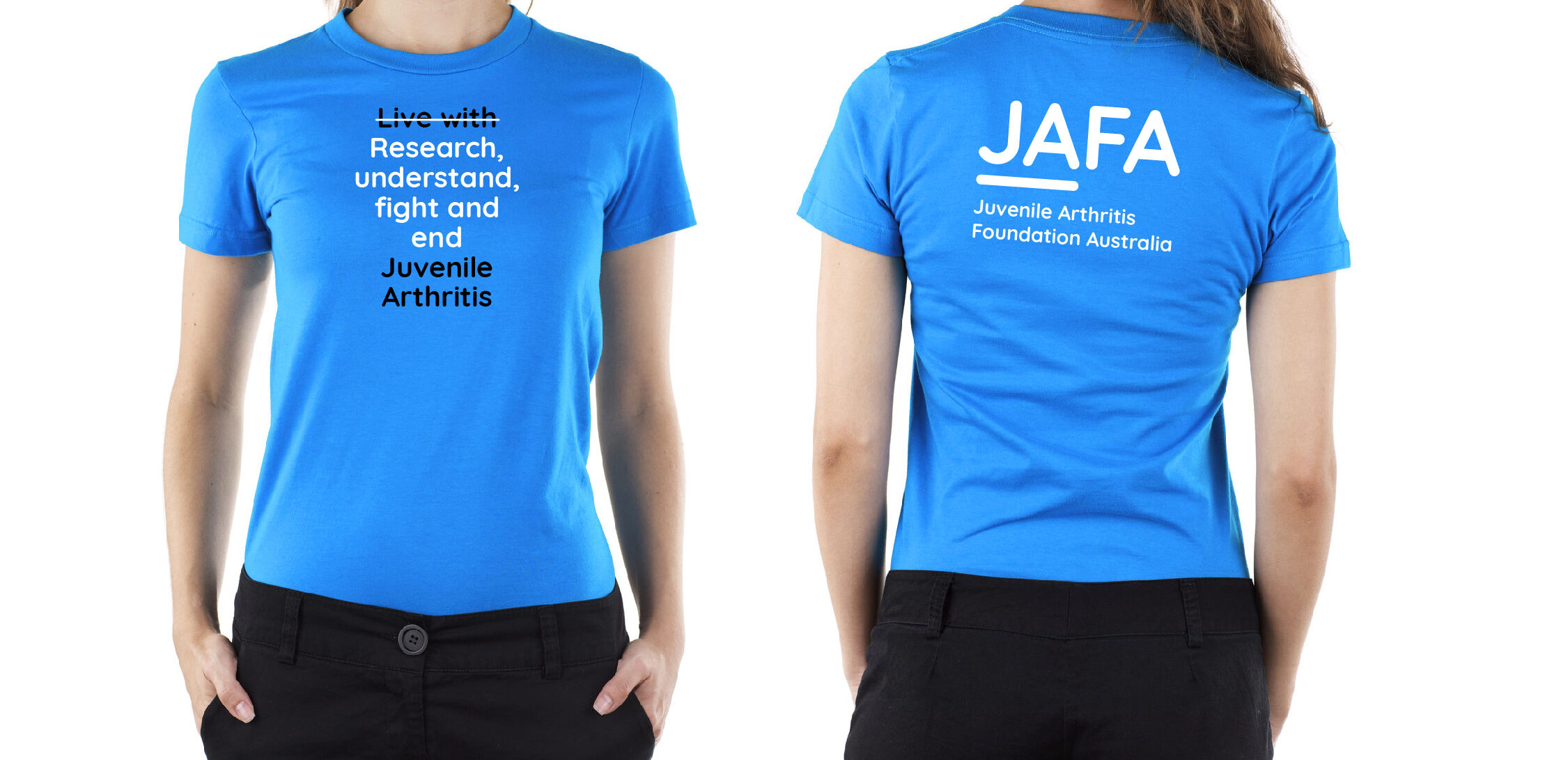
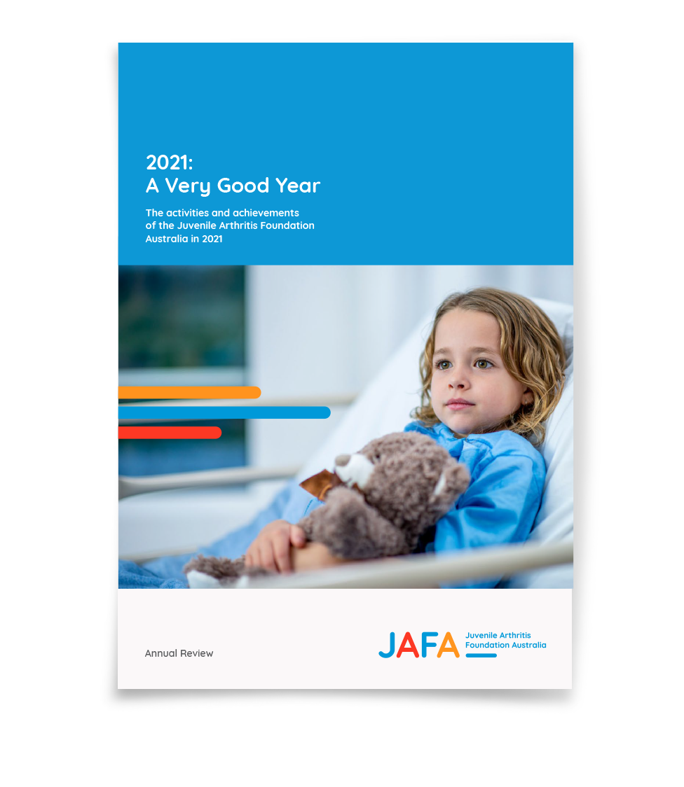
The new JAFA logo incorporates a line device which is used in their branded typographic style, featuring compelling statements and descriptions to highlight the reality of child suffering with JA versus the expectations of a ‘normal’ childhood. The brand’s new imagery and colour palette are strong, simple and distinctive.


