Brand refresh
MinterEllison
The Brief
Design with impact
MinterEllison is Australia’s largest law firm with offices around the globe. But in recent years their graphics and communications had begun to look generic and safe, with a corporate blue colour palette, abstract photography, and plain tone of voice. Wills was approached to revive their brand recognition, make their messaging more expressive, and bring to life their new Purpose: “We create lasting impacts”. As with many large organisations, the new design system had to work well across many brand applications, including being used firm-wide in Microsoft Office, to avoid workflow bottlenecks for their internal design team.
The Challenge
Prove the purpose
Having a brand purpose is only valuable if it is actioned and clearly proven. The new graphics had to be impactful but go beyond just a ‘look and feel’, to clearly state the impact being created. In terms of brand recognition, MinterEllison’s traditional red had been sidelined, in favour of a conservative, corporate blue, punctuated with splashes of yellow. Charts, diagrams, tables and other design elements would need to be redesigned using MinterEllison’s colours. Additional graphic elements would also need to be created, to give the brand visual diversity and allow a richer expression of ideas.
The Solution
Branding that steps up
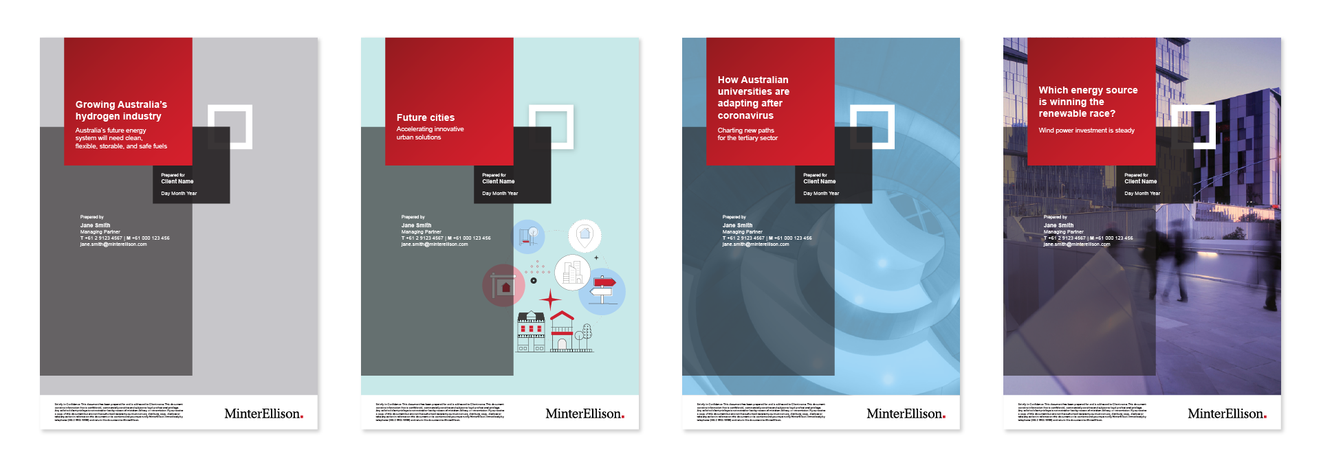
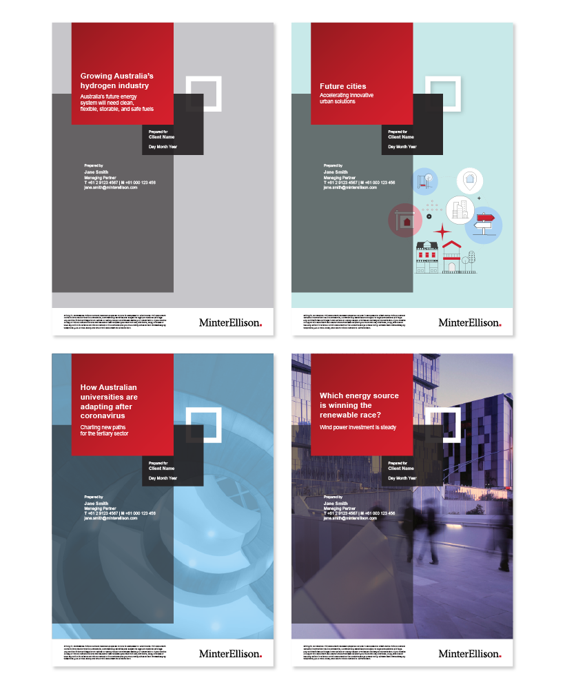
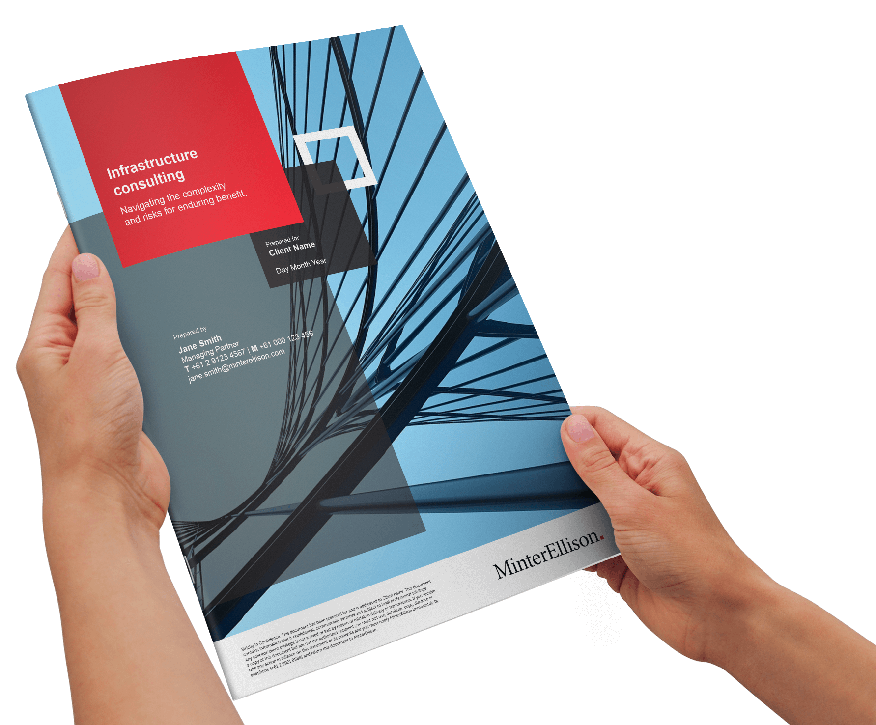
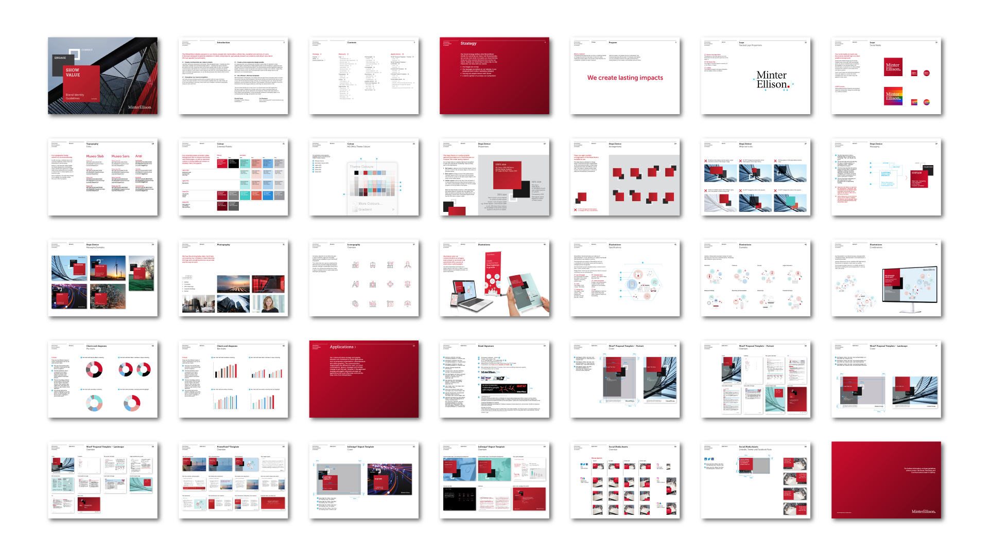
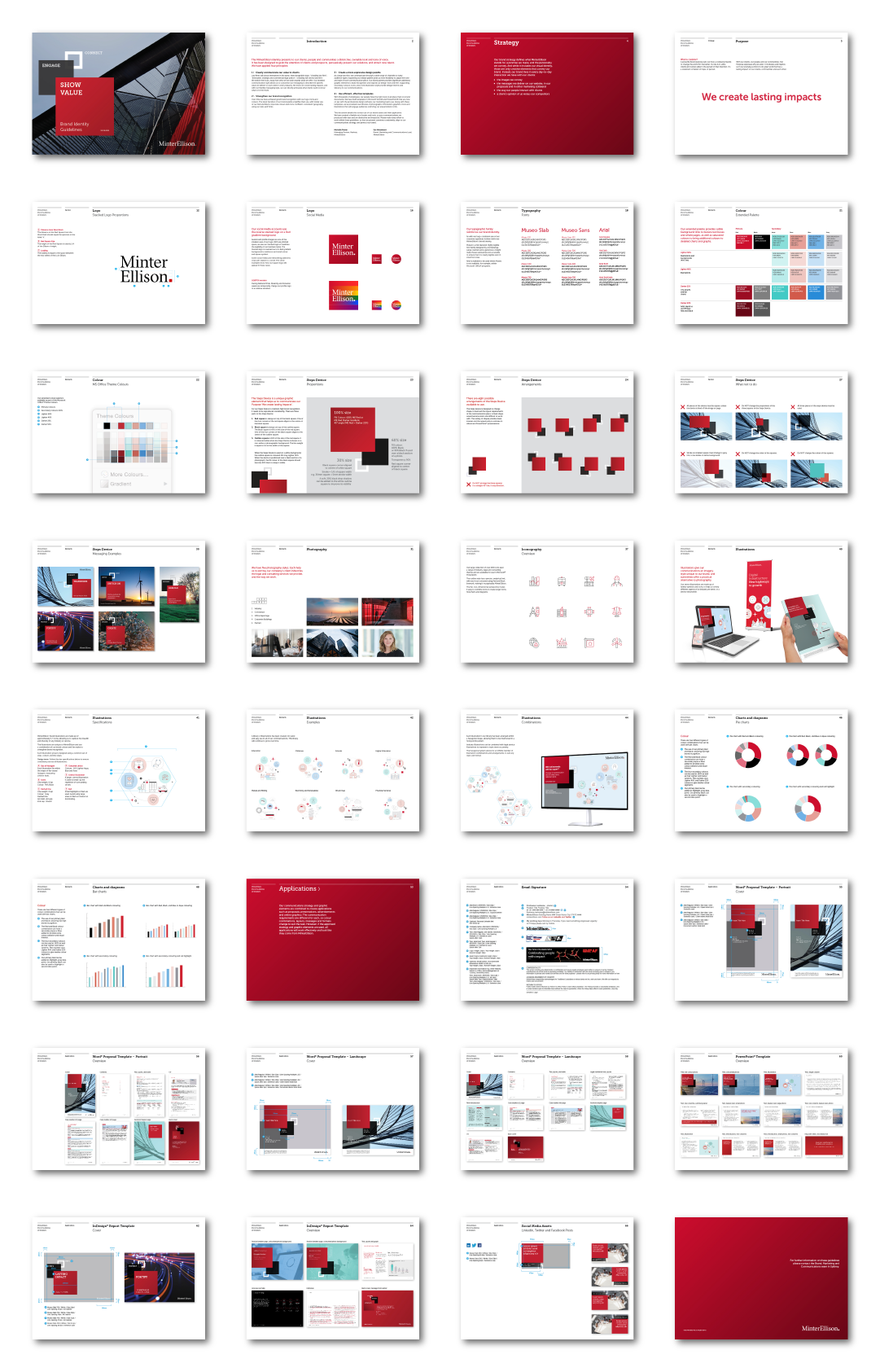
Wills began by returning the primary colours to red and black, supported by a set of paler secondary colours, and a new illustration style. But the big change happened with the creation of the three-box ‘Steps’ device that not only reinforces the logo and colours but provides a holding shape for their new branded tone-of-voice. This messaging style uses three imperative verbs that allows MinterEllison to quickly articulate the strategic guidance they provide clients to create lasting impacts.
The new look and feel is impactfully applied across all marketing channels, from print to digital, from advertising campaigns to MS Office documents and presentations.


