SeeMee Brand Design
Queensland Tertiary Admissions Centre (QTAC)
The Brief
Building skills and connections
Assisting people with their tertiary educational pathways is the core purpose of not-for-profit entity, QTAC. After years of working with young adults, QTAC identified an opportunity to assist with their transition from secondary to tertiary education and to a job. A platform to target the skill gaps of recent school graduates, provide them with training and connect them to potential employers. The brand design for SeeMee, a unique skills, training, and jobs platform, needed to bring to life this unique ecosystem.
The Challenge
Seeing the me in the marketplace
SeeMee was intended to be a unique, standalone brand identity without any visual relationship to QTAC. The brand design needed to appeal to several stakeholders including young adults, prospective employers, and tertiary institutions. Important consideration had to be given to the brand design framework and how a young person could distinguish themselves with their experience, skills, or qualifications i.e., be ‘seen’, striking the right balance between community and individual on the platform.
The Solution
Fun and flexible
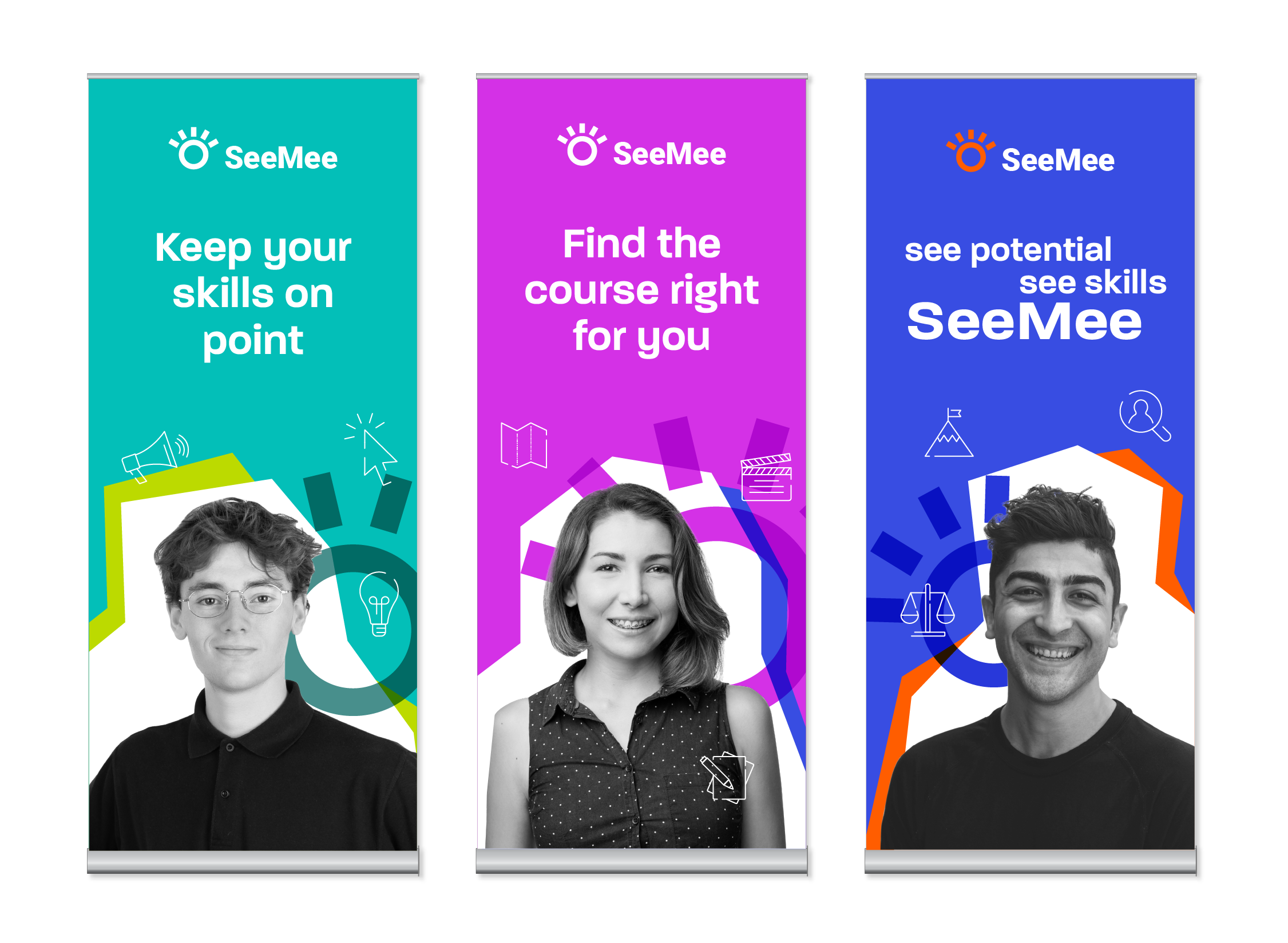
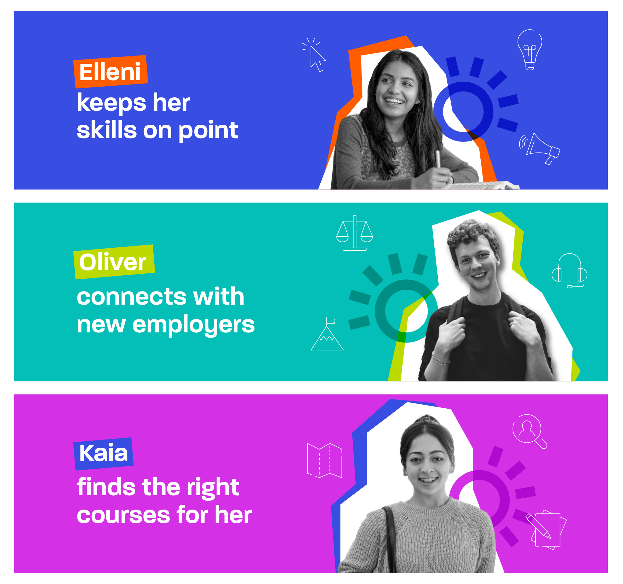
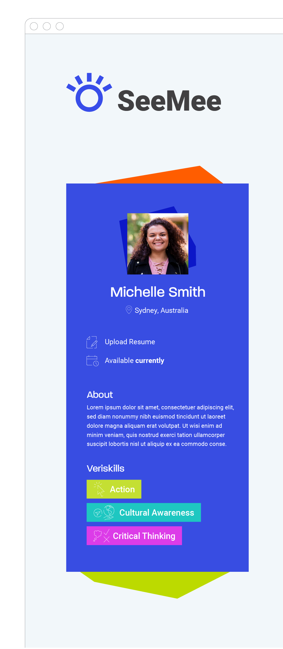
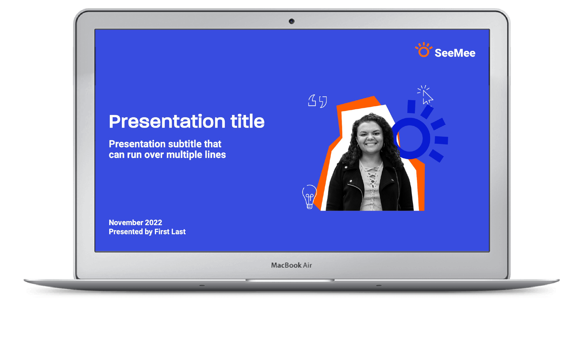
We created an engaging logo incorporating a fun ‘eye’ symbol, a wink to the message that young people would be visible as individuals on the SeeMee platform. This was supported by tone of voice messaging, a unified brand design system of elements highlighting a student's particular skills who could then be matched to employers or training providers. The logo also became a dynamic graphic element, along with a system of cut-outs which framed the student’s photo and name. Combined with a strong, bright colour palette and a menu of skills icons, the brand palette worked together to give the brand a fresh and energetic feel.


