Brand Refresh
VIEW Clubs of Australia (VIEW)
The Brief
Forward into the Future
VIEW is a membership-based organisation for women, with clubs in over 60 communities throughout Australia. Through VIEW clubs, members build strong friendships and connect with a meaningful purpose, fundraising and volunteering to support the work of The Smith Family, helping disadvantaged children succeed at school. VIEW had recently celebrated its 60th anniversary and was looking to the future and ways to evolve, raise their brand’s visibility and grow their membership base.
The Challenge
Evolution and Inclusion
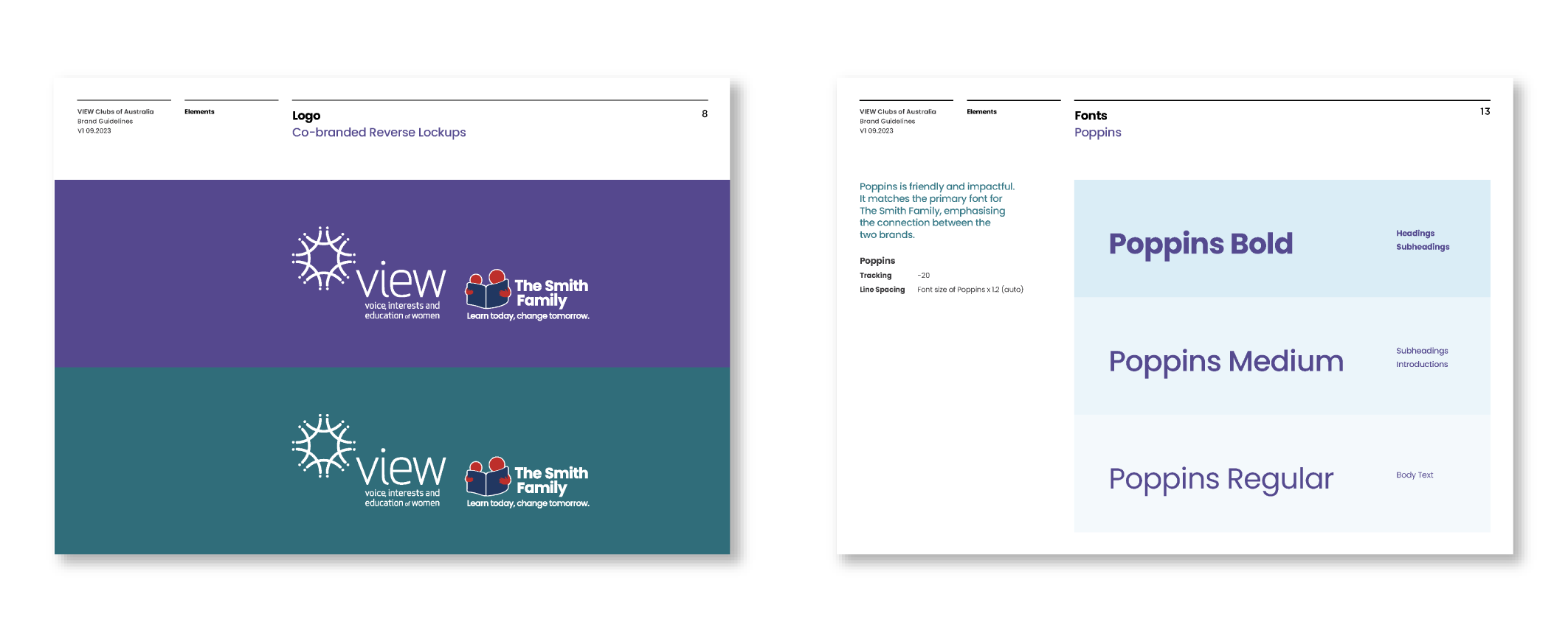
VIEW members feel a sense of pride in and ‘ownership’ of the VIEW brand, so it was essential that they still strongly connected with the refreshed identity. Heritage elements of the VIEW brand were to be retained including the purple, a distinctive colour closely associated with the women’s movement. The VIEW logo was to remain unchanged and for the first time would be used alongside The Smith Family’s new logo. In the modern era of inclusivity and diversity, the new brand also had to be realigned to appeal to an evolving membership base.
The Solution
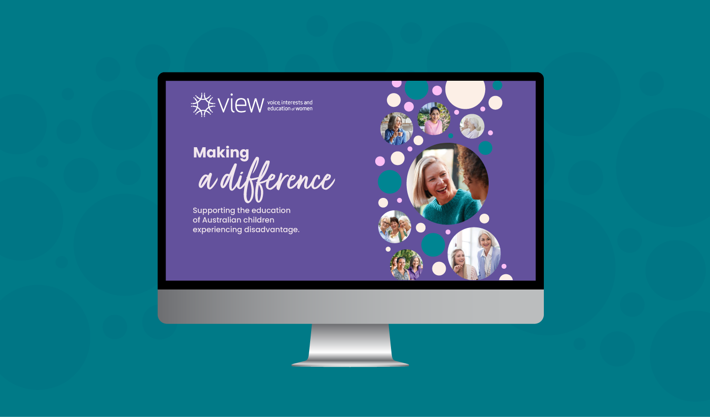
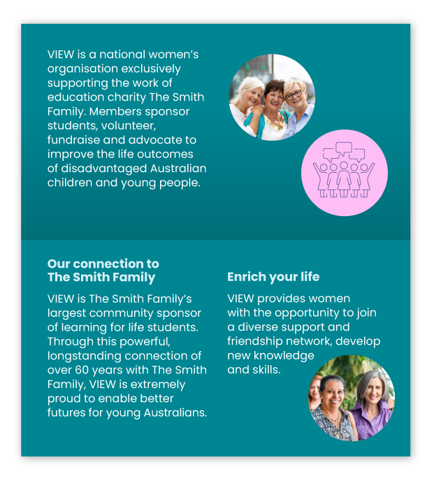
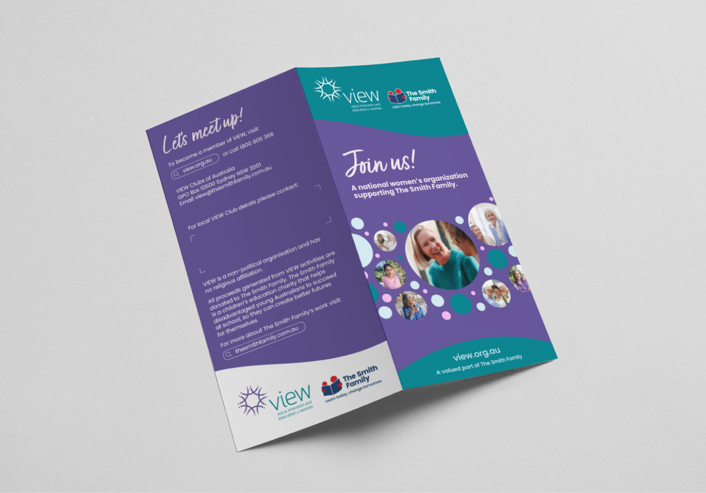
Energy and Revitalisation
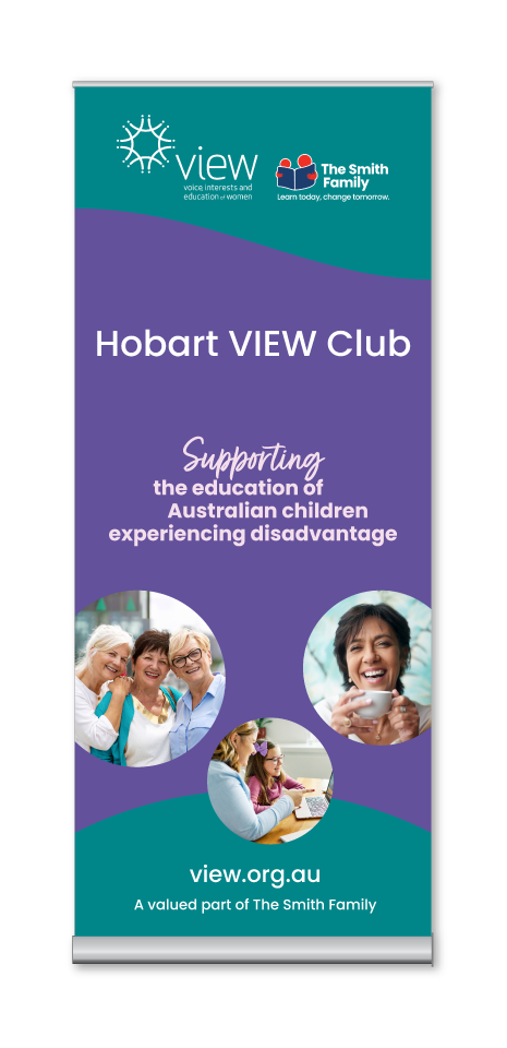
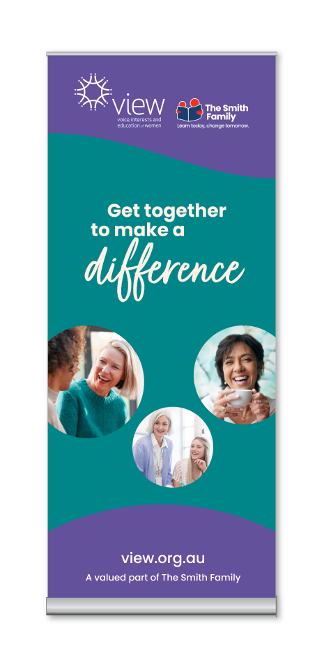
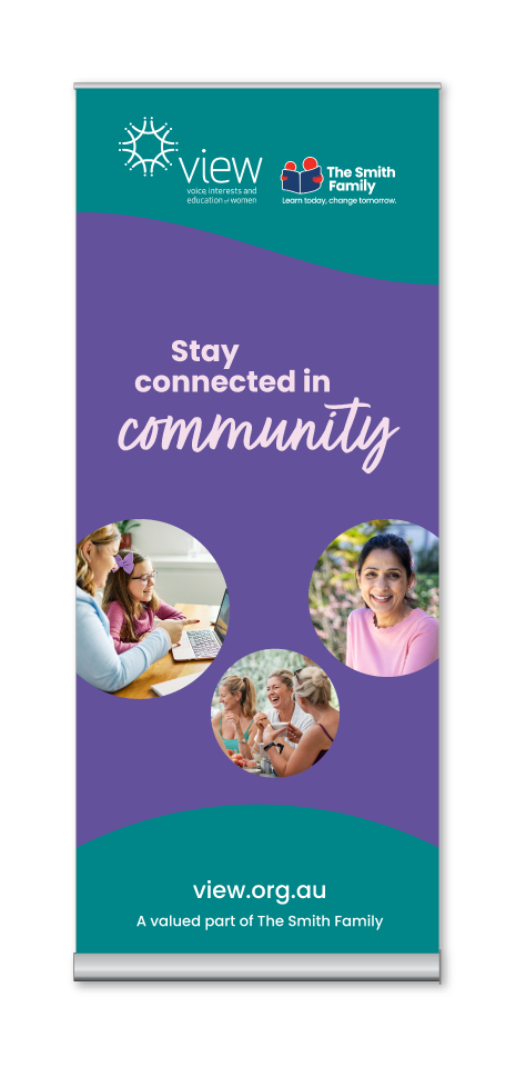
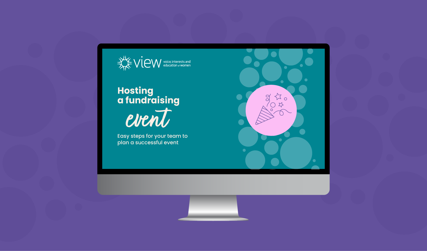
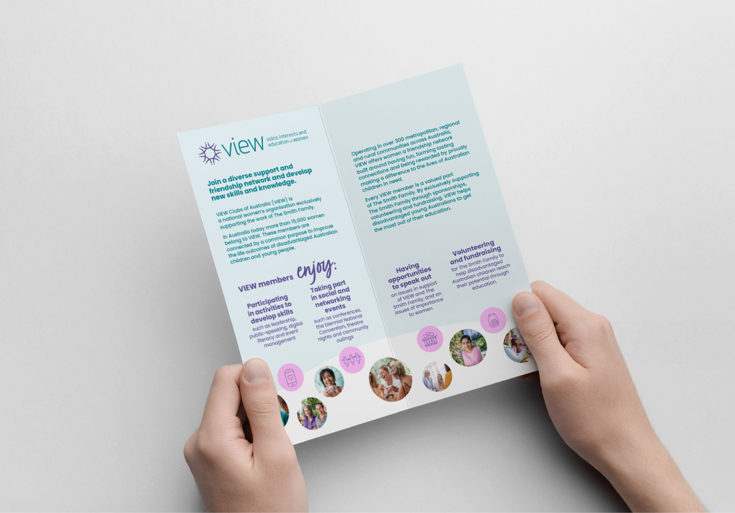
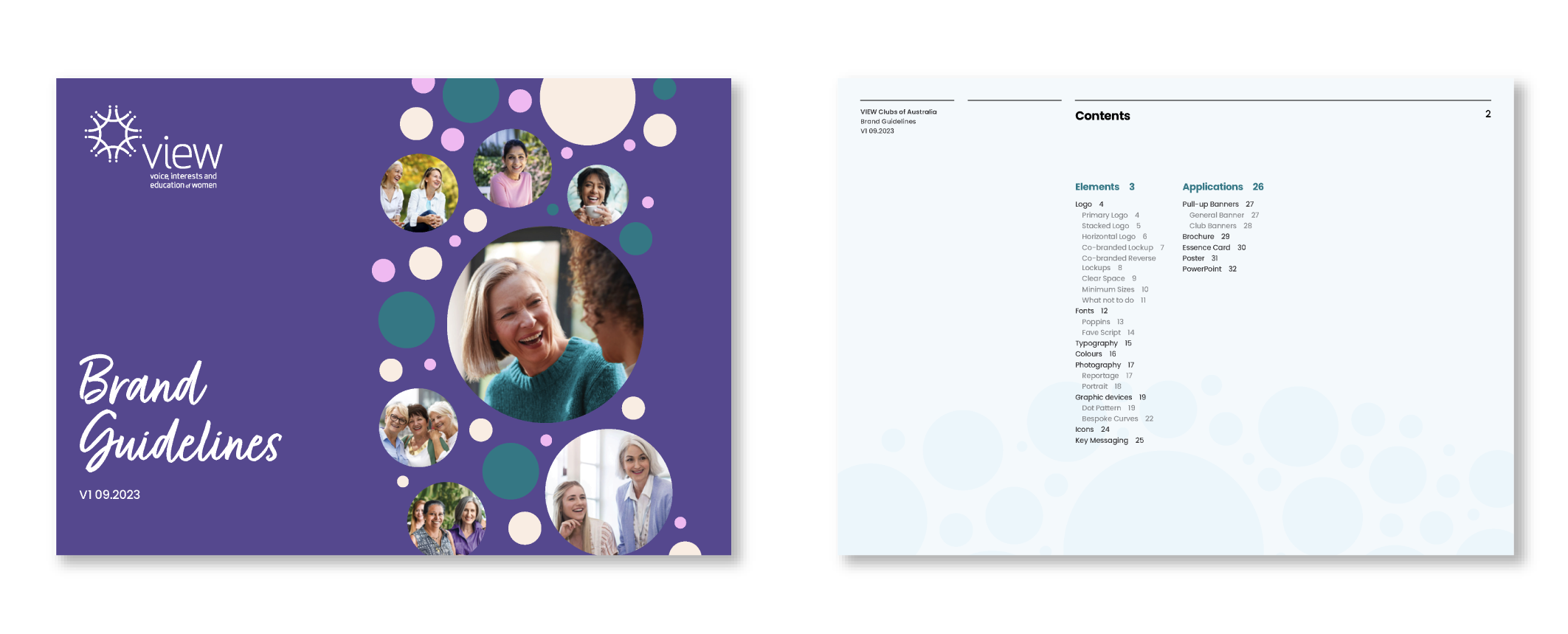
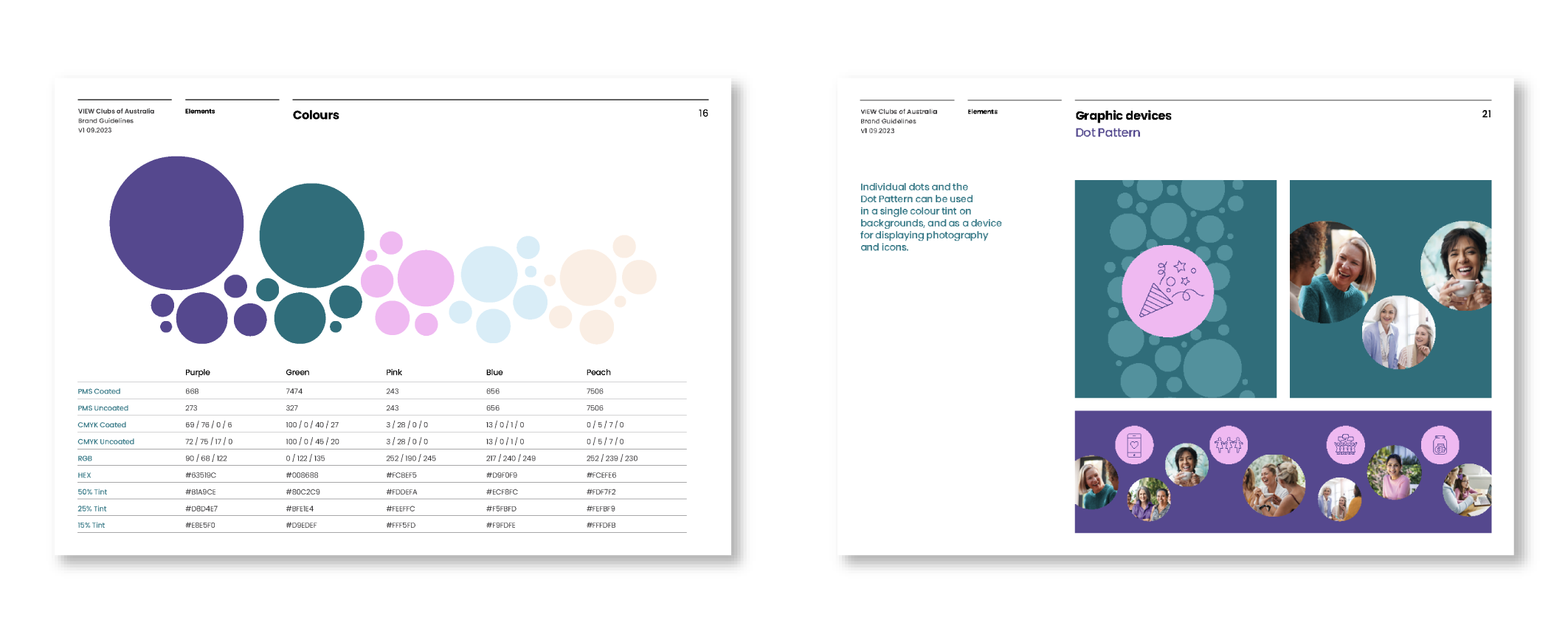
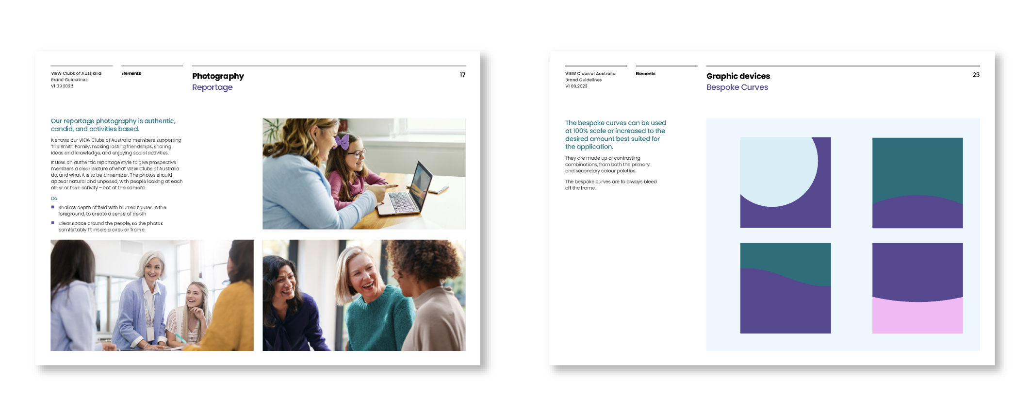
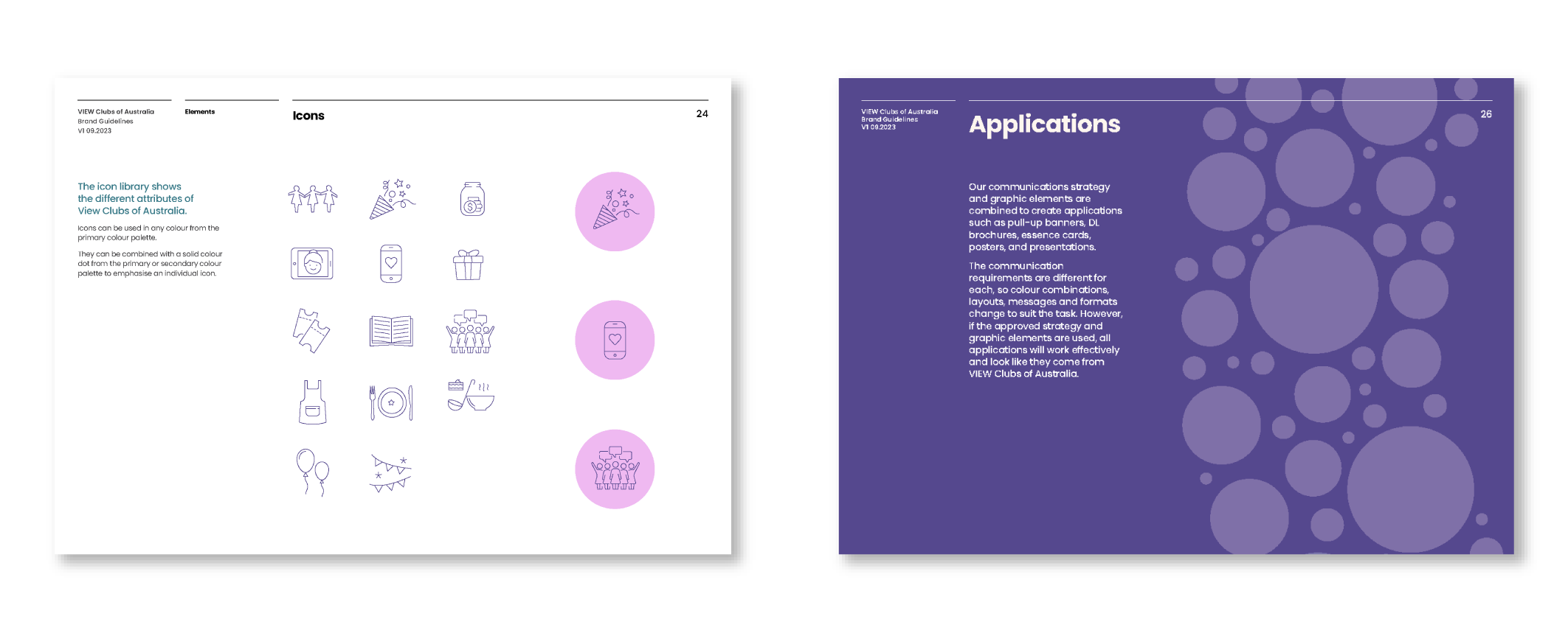
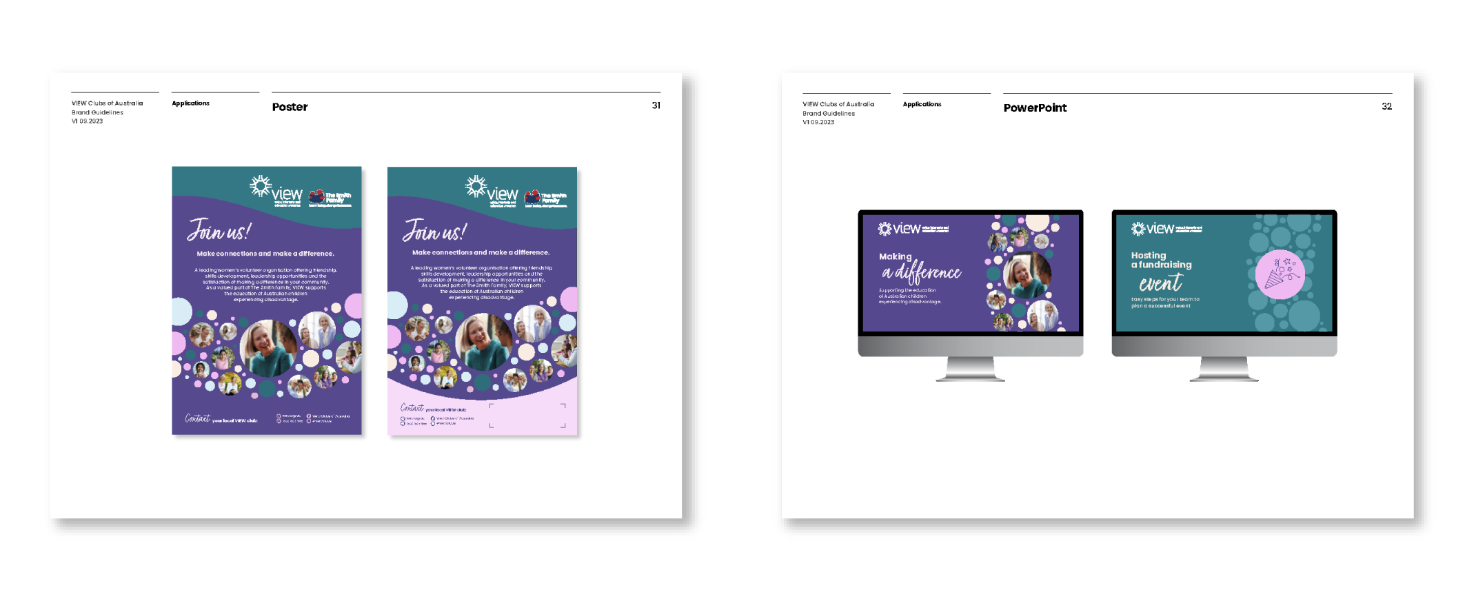
Small details can make a big difference. An expanded colour palette softens and gives contrast to the primary purple and green. Full colour photography of women from diverse cultures helps to engage a wider audience and a new secondary font becomes a welcoming and supportive messaging tool in the palette. The former circle pattern is transformed into a freer, energetic, and friendly graphic device with the flexibility to feature full colour photos of members, activity icons or multiple colours. By building on some of the heritage of the original brand and combining them with several new elements, VIEW’s brand communications have been strongly revitalised.

